


Quick answer
Most storefront signs fall into a handful of familiar categories: channel letters, lightbox and cabinet signs, blade (projecting) signs, dimensional flat-cut letters, and freestanding monument or pylon signs. The right choice depends on your building, your street, your lighting, and how far away people need to read it. Common outdoor materials are aluminum, acrylic, stainless steel, and aluminum composite panel. Readability comes down to contrast, scale, placement, and nighttime lighting, not size by itself.
If you want product examples while you read, browse the outdoor signs collection.
Key takeaways
- The five common storefront sign types are channel letters, lightbox cabinets, blade signs, dimensional letters, and monument or pylon signs.
- Aluminum, acrylic, and stainless steel are widely used outdoors because they tend to hold up to weather and UV without degrading quickly.
- Readability depends on contrast, letter height, mounting height, and lighting, not just overall size.
- Front-lit channel letters are easy to read from a distance. Halo-lit letters give a softer look at closer range.
- Many cities require a permit for permanent exterior signs, and landlords often add their own criteria. Rules vary, so confirm locally.
- A clean, well-lit sign reads as an active, cared-for business. A faded or partly dark one sends the opposite signal.
- Previewing a design on a photo of your actual storefront removes more guesswork than a spec sheet alone.
What are the different types of storefront signs?
The main types are channel letters, lightbox or cabinet signs, blade or projecting signs, dimensional flat-cut letters, and freestanding monument or pylon signs. Each solves a different visibility problem.
Channel letters are individually fabricated letters, usually illuminated, mounted directly to the building or on a raceway. They are a common pick for retail, restaurants, and offices that want a clean, professional look. The sub-types are front-lit (face illumination), halo-lit or reverse-lit (glow behind the letter), and combination-lit (both).
Lightbox and LED cabinet signs are a framed cabinet with an illuminated face, usually acrylic or polycarbonate, printed with the logo. They fit tight facades, awning-integrated designs, and businesses that want one readable panel at night.
Blade signs, also called projecting signs, mount perpendicular to the building so people on the sidewalk can see them. They earn their keep on dense main streets, where a flat wall sign disappears once someone is close to the door.
Dimensional and flat-cut letters are non-illuminated metal or acrylic letters with a clean, architectural feel. You see them on law offices, medical practices, and corporate lobbies, or anywhere a quiet, confident look fits the brand.
Monument and pylon signs stand free at the edge of a property. Monuments sit low to the ground. Pylons stand tall on a pole and are built to be read from a busier road.
Plenty of storefronts run a combination: a primary building sign plus a blade sign or window graphics for foot traffic.
Materials for outdoor storefront signs
Materials that tend to hold up outdoors include aluminum, stainless steel, acrylic with UV-stable pigments, and aluminum composite panel (ACM). These generally resist rust, warping, and fading better than plywood, MDF, or untreated wood.
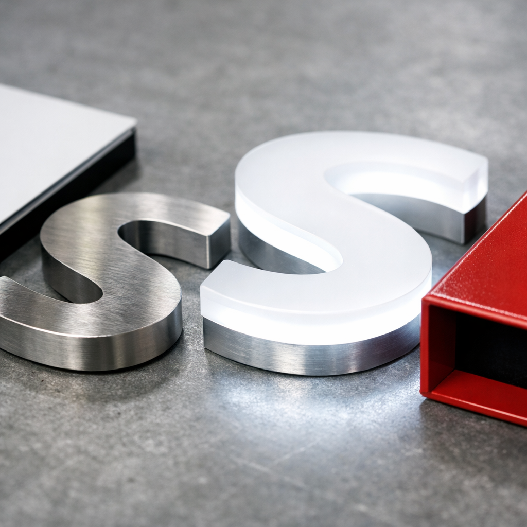
A practical breakdown:
- Aluminum: lightweight, does not rust, and takes paint or finishes well. Used for channel letter returns, cabinet frames, and flat panels.
- Stainless steel: durable, with an upscale look. Common for flat-cut letters and architectural signage.
- Acrylic: used for illuminated faces and dimensional letters. Cast acrylic generally handles outdoor life better than extruded.
- Aluminum composite panel (ACM): flat, rigid, and weather-resistant, which makes it a dependable choice for wall-mounted panel signs.
- Polycarbonate: an impact-resistant alternative to acrylic where breakage is a concern.
- LED components: modern storefront illumination usually uses low-voltage LEDs rated for outdoor humidity and temperature swings.
Mixed-material signs also draw steady interest. Brushed metal returns with acrylic faces, or ACM backers with dimensional metal letters, for example. Those combinations often read as more considered than a single-substrate template.
Longevity shows up in buyer requests too. Recyclable aluminum, low-energy LEDs, and durable finishes can reduce how often a sign needs replacing.
Signage.com's Philadelphia team can talk through material combinations that suit your building and climate. The mix that works best varies by project.
Metal vs. plastic vs. wood storefront signs
For most outdoor storefronts, metal and high-grade acrylic tend to outlast wood. Wood can look great when new, but it can warp, fade, and need refinishing on a schedule many owners would rather skip.
A quick comparison:
| Material | Often used for | Trade-off |
|---|---|---|
| Aluminum / ACM | Panel signs, channel letter bodies, general outdoor use | Can dent on impact |
| Stainless steel | Flat-cut letters, corporate and medical looks | Higher material cost |
| Acrylic | Illuminated faces, dimensional letters | Low-grade acrylic can yellow over time |
| Wood | Boutique, rustic, or historic-district looks | Warps, fades, needs upkeep |
| PVC / low-grade plastic | Short-term interior use | Less durable outdoors, can become brittle |
Metal or acrylic is a reasonable default if you want the sign to still look sharp years from now. Wood makes sense when the look is central to the brand and you accept the maintenance that comes with it.
How to make a storefront sign more visible from the street
Visibility is a mix of contrast, letter height, mounting height, and lighting. A bigger sign is not automatically easier to read. A well-scaled sign with strong contrast often beats a large one crowded with artwork.
Some working rules of thumb:
- Letter height. A common guideline is roughly 1 inch of letter height for every 10 feet of viewing distance. A sign meant to be read from about 100 feet would start around 10-inch letters.
- Contrast. Dark letters on a light background, or the reverse. Avoid combinations that vibrate, like red on green or blue on red.
- Mounting height. High enough to clear parked cars, awnings, and street trees, but not so high it sits above drivers' sightlines.
- Simplicity. The logo, business name, and maybe a short descriptor. Phone numbers and taglines usually belong on the window, not the primary sign.
- A blade sign for foot traffic. If walk-ins matter, consider adding one. A flat wall sign is easy to miss for a pedestrian standing right beneath it.
A sign is often judged before the business is. If it is hard to read, people tend to assume the business is hard to deal with too.
Storefront sign lighting options for nighttime visibility
The main approaches are front-lit channel letters, halo-lit (reverse-lit) letters, backlit lightbox cabinets, and external gooseneck or spot lighting. Each creates a different feel.
- Front-lit channel letters: the face glows. Strong legibility at night from a distance, and a common pick for retail and restaurants.
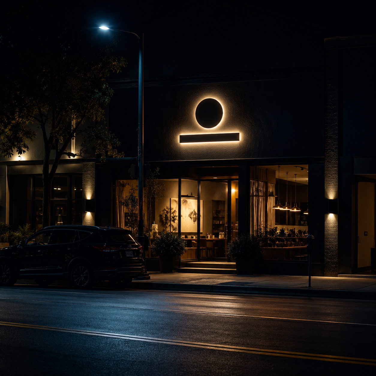
- Halo-lit channel letters: the letter is opaque and glows around its edges against the wall. A softer look, often chosen for hotels, upscale restaurants, medical, and corporate settings.
- Combination-lit: both face and halo. More dramatic, and usually a bigger investment.
- LED cabinet or lightbox: the whole face lights up. Handy for detailed logos that would be hard to fabricate as individual letters.
- External lighting (goosenecks, spots): fixtures aimed at a non-illuminated sign. Common for historic buildings, boutique retail, and areas with restrictive sign codes.
If your street gets dark early or the storefront sits back from the road, illumination matters. A dark storefront in the evening can read as closed even when it isn't.
What affects the cost of a storefront sign?
Storefront sign costs vary widely based on type, size, materials, illumination, and installation complexity. A small non-illuminated panel sign is a very different project from a large illuminated channel letter set on a two-story facade, so a single number rarely fits every situation.
The factors that tend to move cost the most:
- Sign type (channel letters and monuments generally involve more than flat panels)
- Size and letter count
- Illumination (LEDs, transformers, electrical hookup)
- Mounting surface (brick, EIFS, metal panel, and stucco each install differently)
- Height and access needs
- Permits and any required engineering drawings
- Landlord or property-management requirements
For a figure tied to your specific project, a free quote request with photos, dimensions, and your logo file will get you closer than a generic online estimate. Ballpark ranges rarely account for your actual building.
Storefront sign size and regulations
Many cities regulate storefront sign size based on facade width, sign area, height above grade, and illumination type. Rules vary by municipality and often by zoning district within the same city, so treat the items below as things to check rather than fixed limits.
Commonly regulated items:
- Maximum sign area (often expressed as square feet per linear foot of storefront)
- Maximum letter or overall sign height
- Illumination restrictions (some historic districts limit internal illumination)
- Projection distance for blade signs
- Setback rules for monument and pylon signs
- Total number of signs per business
Landlords and property managers frequently layer their own criteria on top of city code, especially in shopping centers and mixed-use developments. It is worth getting the tenant sign criteria in writing before you design anything.
Do I need a permit for a storefront sign?
In many places, permanent exterior signs require a sign permit, and illuminated signs often require an additional electrical permit. Window graphics, small blade signs, and temporary signs may fall under different rules. Requirements vary by location, so confirm with your municipality.
Related research: Compare storefront sign permit fees across 20 U.S. cities, then use the data and official-source hub to review every city calculation and source.
The permit process commonly involves scaled drawings, elevation views, material specs, illumination details, and sometimes structural or electrical engineering. That is part of why photos and building dimensions matter early on.
Signage.com does not guarantee permits or code compliance on your behalf, and any Design Studio mockup is a visual preview rather than permit, fabrication, or code-compliance documentation. A good sign partner can still help you anticipate likely permit considerations before you approve fabrication.
How to choose fonts and colors for a storefront sign
Pick one strong, legible typeface and a two- or three-color palette that ties to your brand. A storefront sign is generally not the place for decorative script fonts, very thin weights, or five colors fighting for attention.
Some practical guidance:
- Favor a clean, geometric sans-serif for readability at distance.
- If the brand logo is a script or serif, keep the surrounding elements simple.
- Test the color combination in daylight and at night. Some colors that look great by day can wash out when illuminated.
- Match the sign palette to the storefront materials rather than fighting them. A sign that complements the building usually looks better than one that clashes.
- Reserve accent colors for small elements, not the primary letter fill.
Common storefront sign mistakes
Frequent mistakes include overcrowding the sign with text, choosing letters that are too small, ignoring nighttime visibility, and skipping the mockup step.
The usual problems:
- Trying to fit a tagline, phone number, website, and hours onto the primary sign
- Low contrast (light gray on white, dark blue on black)
- Fonts that are on-brand but hard to read at 50 feet
- Skipping illumination in a district that goes dark early
- Ordering from rough phone measurements rather than tape-measured dimensions
- Approving a design flat on screen instead of previewing it on the actual building
- Choosing the lowest-grade materials, then replacing the sign much sooner
A visual preview on a photo of your storefront catches many of these before production. That is what Signage.com's Design Studio is built for: comparing letter style, color, illumination, and scale on your own building as a visual mockup, before you move to fabrication.
Storefront signs for small businesses on a budget
You can get a professional-looking storefront sign without going premium on every element. The idea is to pick one strong primary sign and skip extras that add cost without adding much visibility.
A few budget-conscious moves:
- Non-illuminated dimensional letters on an ACM panel instead of full channel letters
- A single well-designed blade sign instead of both wall and blade
- Window graphics for hours, phone, and taglines instead of a second sign
- External gooseneck lighting instead of internally illuminated letters
- Raceway-mounted channel letters (one mounting bar) instead of individual flush mounts, which can cut installation labor
Where cutting corners tends to backfire: material grade, LED quality, and installation. A low-grade substrate or LED can end up costing more if it fails early.
Storefront sign maintenance tips
Storefront signs generally need light but regular maintenance: cleaning, LED checks, and periodic inspection of mounting hardware and seals. Most signs fail gradually, one dead letter or one cracked seal at a time.
A basic routine:
- Wipe faces every few months to clear dust, pollen, and grime
- Check illumination regularly and fix a dark or partially lit letter promptly
- Inspect mounting points and raceways at least once a year
- Reseal caulk lines that are cracking
- Refinish external metal parts when the finish starts to degrade
A faded or partly dark sign can quietly undercut credibility. If the sign looks neglected, customers may wonder what else is.
What makes a storefront sign effective?
An effective storefront sign is readable from your customer's actual approach, lit during your operating hours, on-brand without being busy, and well maintained.
The signs that work tend to do a few things. They carry one clear idea instead of five competing ones. They read in a few seconds from the sidewalk or the road. They look like they belong to an established business. And they stay clean, lit, and intact.
Alternatives when you can't install a permanent sign
If your lease, landlord, or historic district limits permanent signage, you still have options: window graphics, A-frame sidewalk signs, awning signage, hanging blade signs on existing brackets, and freestanding lobby signs visible through the window.
Alternatives that work in restricted situations:
- Cut vinyl or printed window graphics with logo and hours
- Interior lobby signs positioned to read through the front window
- A-frame or sandwich boards where permitted
- Fabric awnings with printed graphics (often treated differently under sign codes)
- Removable window clings for seasonal or promotional messaging
These can also bridge the gap while you wait on a permit for permanent signage.
FAQ
How long do outdoor storefront signs typically last? Quality aluminum, acrylic, and stainless steel signs with modern LEDs can last many years with basic maintenance. Lower-grade substrates and LEDs may fail sooner. Actual lifespan depends on materials, environment, and upkeep.
Can I install a storefront sign myself? Small non-illuminated signs, sometimes yes. Illuminated signs, larger signs, or anything requiring a permit often call for a licensed installer and electrical work. Landlord and city requirements may also affect who can install.
What is the difference between front-lit and halo-lit channel letters? Front-lit letters glow through the face and read well from a distance. Halo-lit letters are opaque and glow around their edges against the wall, for a softer look at closer range.
How do I know what size my storefront sign should be? Start with your facade dimensions, viewing distances, and any landlord or city size limits. A common guideline is roughly 1 inch of letter height per 10 feet of viewing distance, adjusted for how quickly people pass by.
What does a sign company need to give me an accurate quote? Photos of the storefront, approximate dimensions, your logo file, indoor or outdoor location, a preferred sign type if you have one, illumination preferences, and any known landlord or city requirements. The more you provide upfront, the more accurate the quote tends to be.
Where can I see storefront sign options before ordering? Browse the outdoor signs collection for product examples, or start a mockup in the Design Studio to preview options on your own building.
Before you order
A storefront sign is often the first thing a customer sees about your business, so it is worth getting right. Choose a type that fits your building and your street, pick materials suited to lasting outdoors, and get the basics right: contrast, scale, placement, and lighting.
A few next steps:
- Take clear photos of your storefront from the sidewalk, from across the street, and at night.
- Measure your available sign area.
- Check your lease and local sign code for size, illumination, and permit rules.
- Gather your logo files in vector format.
- Request a free quote or start a visual mockup in the Design Studio to compare options on your actual building.
The more clarity you bring to the conversation, the closer the finished sign is likely to be to what you had in mind.
