


A mockup is only as good as what you feed it. The clearer your photos, the more accurate your measurements, and the more you say about your brand and your location, the closer a preview gets to how the sign might actually look on your building. This guide covers what to gather before you ask for a quote, so a provider like Signage.com can build a mockup that reflects your setting instead of a stock template.
Key takeaways
- Take several photos of your storefront or building from different angles and distances, including close-ups of the surface where the sign will mount.
- Measure the sign area, the surrounding wall space, and anything in the way. A tape measure or a laser tool both work.
- Send high-resolution logo files. Vector formats (AI, EPS, SVG) scale cleanly and keep artwork sharp.
- Say what kind of lighting you have in mind: front-lit, halo-lit, or none.
- Mention any material or finish preferences, like acrylic or metal.
- Point out windows, doors, pipes, or trim that could affect size or placement.
- Explain what you want the sign to do for you.
- Signage.com's Design Studio is an AI-assisted mockup aid that previews options from the details you provide.
Why photos and measurements matter
An accurate mockup starts with real photos and real numbers. Without them, any preview is a guess. These details help confirm that a proposed sign fits the space, looks proportional, and matches what you pictured, so you can catch questions before production rather than after.
Signs are a visual purchase, and people tend to think hard about them before committing. Scale, placement, and lighting all shape the first impression, and a vague request usually gets you a vague mockup back. The more grounded your inputs, the more a designer can show you something that looks like your location.
One way to frame it: you're giving a designer who has never seen your storefront enough to picture it as if they were standing across the street from it.
What photos help
Photos let a designer place your sign in its actual setting. Shoot the whole storefront or building, not just the spot where the sign goes, and add close-ups of the mounting surface.
- Full storefront shot. Photograph the whole facade from across the street and slightly off to the side. This shows the architecture, what surrounds it, and the sightlines.
- Close-up of the mounting surface. Get detailed shots of the wall, fascia, or structure where the sign attaches, including texture, existing fixtures, and any visible electrical access. This tells a designer a lot about how the sign can mount and which materials suit the surface.
- Contextual shots. Photograph the building from the angles your customers use: from a passing car, from the sidewalk, and walking up to the door.
- Nearby signs. If other signs sit close by, say on a shared monument sign, include them. It helps your design fit in rather than fight what's already there.
- Day and night. If you're weighing an illuminated sign, shoot in daylight and after dark so a designer can see how the surrounding light behaves.
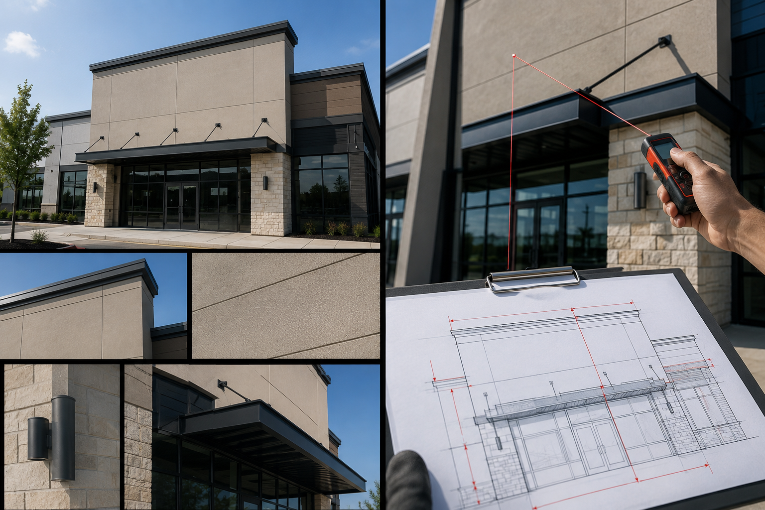
Measurements to include
Measurements set the size, the proportion, and whether the sign reads well. Rough numbers tend to produce mockups that sit wrong in the space, which means more back-and-forth before you get something usable. A good quote really starts before you request it, with careful numbers.
| Measurement | What to record | Why it matters |
|---|---|---|
| Available sign area | Width and height of the wall, fascia, or pylon area | Sets the sign's maximum size and proportion |
| Height from ground or road | Distance to the bottom and top of the sign area | Affects how visible storefront and blade signs are |
| Obstructions | Distance to windows, doors, vents, pipes, awnings | Keeps letters or lightboxes from blocking anything |
| Existing signage | Size of a sign you're replacing or adding to | Helps a new sign match or fit an existing structure |
| Entryway or interior wall | Width and height for lobby or reception signs | Keeps indoor signs in scale with the room |
| Preferred size (optional) | Any target size you already have in mind | Lets a designer weigh your preference against legibility |
A few practical notes:
- Measure to the nearest inch or centimeter, and check each number twice.
- A quick sketch with the dimensions marked pairs well with your photos.
- If you have a size in mind, share it, but include the available space too. That way a designer can suggest dimensions that read well from the distances that matter to you.
Details that sharpen a mockup
Photos and measurements do the heavy lifting. A handful of extra details make the difference between a decent mockup and one that actually looks like your brand, and they help a provider like Signage.com steer you toward sign types that fit, whether that's channel letters, acrylic, or metal.
Logo and brand assets. Send your logo as a vector file (AI, EPS, SVG). Vectors scale without going fuzzy, so the artwork stays clean in the mockup and in production. If you have brand guidelines, share the color values (CMYK, Pantone), fonts, and any usage rules so the design stays on brand.
Sign type and lighting. Are you picturing channel letters, a lightbox, dimensional letters, or a blade sign? Naming a type narrows things fast. Also say whether you want it front-lit, halo-lit, open-face, or not lit at all, since that changes the look quite a bit.
Materials and finish. Metals like aluminum, steel, or brass; plastics like acrylic or PVC; and finishes from matte to gloss to brushed or polished all read differently and hold up differently indoors versus outdoors. If you have a leaning, say so.
Mounting surface and location. Brick, stucco, metal paneling, and glass each call for a different mounting approach, so mention what the sign attaches to. And note whether it lives inside an office or outside a storefront, because weather exposure shifts the material choices.
Visibility. How far away does the sign need to stay readable: a main road, a pedestrian street, an interior lobby? And is it mostly seen in daylight, at night, or both? Both answers feed the lighting decision.
Landlord or property rules. If you know of any landlord or property-management limits on size, type, materials, or illumination, mention them. Signage.com can't tell you what a permit or lease will require, but knowing the restrictions early lets a design account for them.
Budget range (optional). A rough range helps a design team suggest materials and sign types that line up with what you expect to spend.
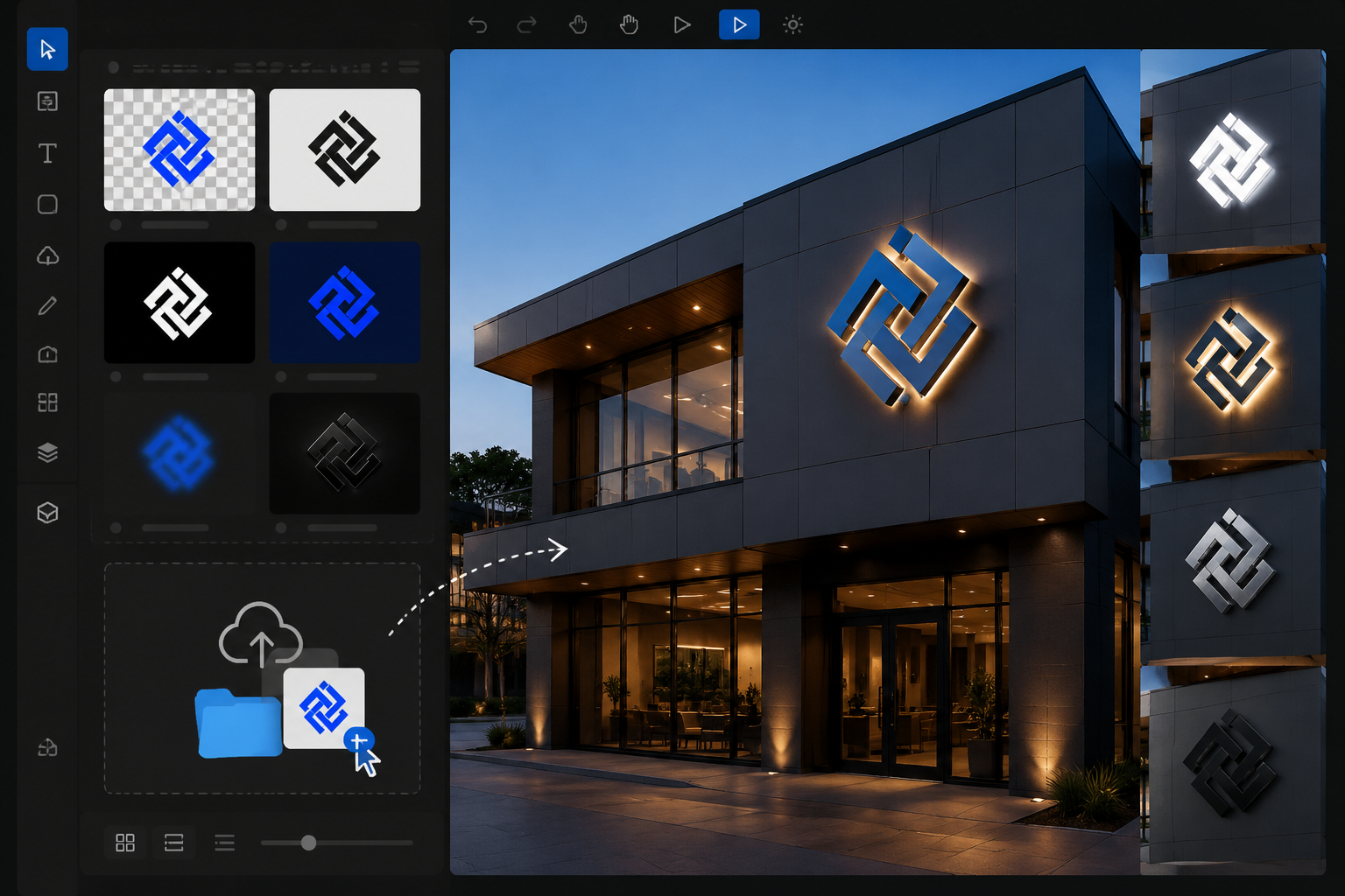
The Signage.com Design Studio is an AI-assisted visual mockup workflow that takes inputs like these and helps you preview sign concepts before you start a quote. Use it to picture options. It isn't final engineering, permit, fabrication, or code-compliance documentation.
Why a detailed mockup helps you decide
A mockup is a decision tool, not just a pretty picture. It turns a concept into something you can judge before anyone fabricates it, which is usually where a visual buying decision gets easier. A sign is often the first thing people notice, so it's worth previewing how it reads.
Whether you run a retail store, a restaurant, a medical office, or a corporate space, a good mockup lets you weigh a few things:
- Does the sign look right against your building's architecture?
- Is it placed where people can see it while clearing windows, awnings, or other obstructions?
- Can your name and logo be read from the distances that matter, day and night?
- How do options like metal versus acrylic, or front-lit versus halo-lit, change the feel?
- Does it represent your brand the way you want?
- And when you need sign-off from a landlord, property manager, or colleague before you spend money, a clear mockup gives everyone something concrete to react to.
Give a design team clear photos, measurements, and preferences, and you get back a preview that reflects what you actually had in mind, which tends to save time and cut down on surprises.
FAQ
What file format works for my logo?
Vector formats (AI, EPS, SVG) are the ones to send. They scale to any size without losing clarity, so your artwork stays sharp in the mockup and in the finished sign.
Can I get a mockup without exact measurements?
You can, but a mockup built on rough numbers will be less accurate. Precise measurements make the preview more realistic and more useful.
How many photos should I provide?
Aim for several high-resolution shots: a wide view of the whole building, a close-up of the exact mounting surface, and a few from the distances your customers actually use.
What if I'm not sure about the sign type or materials?
Send your photos, measurements, and goals anyway. With that context, a design team can suggest sign types (channel letters, lightbox signs, dimensional letters, and others) and materials that suit your setting.
Does a mockup show lighting for illuminated signs?
A mockup for an illuminated sign can show lighting styles like front-lit and halo-lit, so you can see how it might look in daylight and after dark.
Can I compare color options in a mockup?
Yes. If you provide brand color codes (Pantone, CMYK), a mockup can reflect them, and it can often show variations if you're still exploring palettes.
Getting started
It mostly comes down to clarity and a little prep. Detailed photos, careful measurements, high-resolution logo files, and clear notes on materials, lighting, and placement give a signage partner what it needs to build an accurate preview. Gathering all of it up front cuts the guesswork and rework, and it helps you feel confident about the sign you end up ordering.
When you're ready, pull together your photos and measurements and start your free quote and mockup, or explore options first in the Design Studio.
