


Sign size is easy to underthink and expensive to get wrong. Too small, and people driving or walking past just miss you. Too large, and the sign fights your building's architecture, or runs past a size limit set by your city or landlord that nobody checked first.
There isn't one right number. The size comes out of three things: how far away people need to read it, how much room your storefront actually gives you, and what your local rules and lease allow. Below is how each one works, along with a legibility rule of thumb, the tradeoffs between business sign types, and the details worth gathering before you ask for a custom sign quote.
Key takeaways
- Viewing distance sets your floor. The distance and speed at which people approach the sign decides the minimum letter height you can get away with.
- Size to the storefront, not just the wall. Match the sign to the building's proportions, its fascia width, windows, and entry, so it reads as intentional.
- Check your constraints before you design anything. Zoning and landlord rules often cap sign area, height, and how far a sign can stick out.
- Letter height is a useful anchor. A common starting point is about one inch of letter height per 10 feet of viewing distance.
- Sign type changes the math. Channel letters, lightbox cabinets, blade signs, and monument signs all behave differently on size.
- Mock it up first. Previewing on a photo of your own storefront takes a lot of the guesswork out of scale.
Why distance and storefront scale come first
Your sign is often the first thing a potential customer sees, and they judge it in about a glance. If it's hard to read from where they are, some keep going. So sizing should start from the people you want to reach and where they're standing or sitting when they look up.
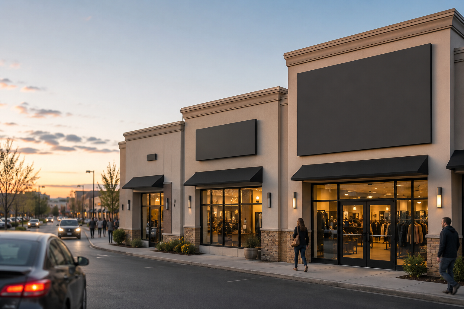
A few things tend to drive the call. Traffic speed matters most on a busy road, where drivers have only a couple of seconds to catch and read the sign, so letters need more height and clean contrast. A slow side street or a parking-lot approach is far more forgiving.
Then there's who's looking. In walkable districts you can often go smaller, though the sign still has to hold its own next to the storefronts on either side. Blade signs, the ones that project out perpendicular to the wall, work well for sidewalk sightlines.
Building proportions come into it too. A tall facade wants more vertical presence, while a wide fascia may take a longer sign or a logo-plus-wordmark layout. Size to the wall you actually have, and work with the existing lines, windows, awnings, and entry rather than against them. Note anything that could block the view: trees, columns, parked vehicles, or a neighbor's projecting sign.
What actually sets the size
Legibility: the 10-feet-per-inch guideline
The common rule of thumb for letter height is roughly one inch of capital-letter height for every 10 feet of viewing distance.
So if people need to read your main lettering from about 100 feet out, aim for letters somewhere around 10 inches tall. Treat that as a floor, not the final answer. Font weight, stroke width, color contrast, and whether the sign is lit all change real-world legibility. A thin, low-contrast letter needs more height than a bold, high-contrast one at the same distance.
Zoning and landlord rules
Confirm the outside limits before you get attached to a design, because they can cap what you're allowed to put up.
Many municipalities regulate maximum sign area, height, how far a sign can project from the building, and sometimes illumination. Rules vary by location and zone, so check with your local authority rather than assuming. Commercial properties often set their own standards on top of that, covering size, materials, colors, mounting, and sign type, and those are sometimes stricter than the city's. Ask for the tenant sign criteria in writing and read your lease before you plan.
Knowing these up front keeps your design inside what's allowed, and it saves you from reworking a sign that's already built.
Sign type and its sizing tradeoffs
Different formats size differently. A quick comparison:
| Sign type | Typical use | How it behaves on size |
|---|---|---|
| Channel letters | Storefront fascia, individually mounted or on a raceway | Flexible layout; each letter still has to be scaled to the facade. Front-lit reads strongly at night; halo-lit gives a softer glow. |
| Lightbox / cabinet signs | Enclosed, internally lit cabinet | Size driven by message area and available wall space; a larger face is more visible after dark. |
| Monument & pylon signs | Freestanding, set back from the building | Usually need larger dimensions to read from a distance, especially along wider roads. |
| Blade signs | Projecting, perpendicular to the wall | Good for pedestrian sightlines; projection size is often the most constrained by local rules. |
| Dimensional letters | Lobbies, offices, close-range exterior | Can be smaller up close; outdoor use needs enough height and depth to register. Acrylic and metal give a clean look. |
You can browse formats and configurations on the outdoor signs collection to see how each type is typically built.
Mock it up before you decide
Guessing at scale from measurements alone is hard. A size that sounds right on paper can look undersized on a wide facade or crowded on a narrow one.
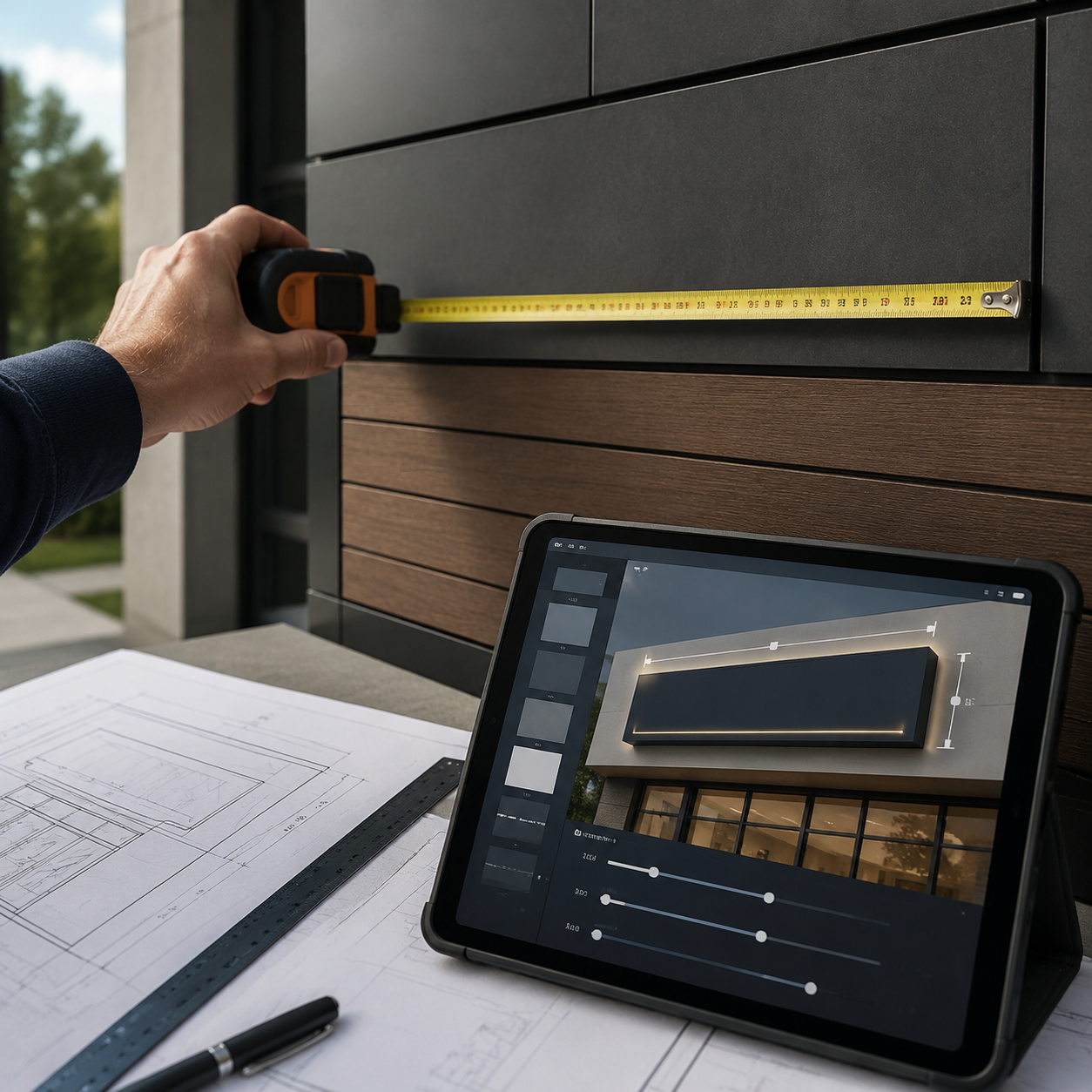
Signage.com's Design Studio lets you preview sign concepts on a photo of your own storefront, so you can compare sizes, letter styles, colors, and illumination in context before you commit. It's a way to explore proportion and placement, not a stand-in for final engineering drawings, permit documents, fabrication specs, or code-compliance sign-off, which are handled separately. Used that way, it turns "I think this looks about right" into something you can actually see and adjust.
Sizing by business type
| Business type | Primary viewing distance | Key size drivers | Common formats |
|---|---|---|---|
| Retail store | Car & pedestrian | Visibility, brand recognition, storefront presence | Channel letters, lightbox, blade signs |
| Restaurant / café | Car & pedestrian, day & night | Legibility after dark, ambiance | Illuminated channel letters, lightbox, LED-style signs |
| Office / corporate | Close range (entry, lobby) | Professional appearance, brand consistency | Dimensional acrylic or metal letters, lobby signs |
| Medical office | Navigation & wayfinding | Clarity, easy to locate | Building signs, dimensional letters, wayfinding |
| Service business | Local car & pedestrian | Clear identification, easy recognition | Channel letters, lightbox, building signs |
Use this as a starting point and adjust to your actual site, distances, and local rules.
Starting your quote with size in mind
A useful quote starts before you submit the form. The clearer your inputs, the closer the estimate and the less back-and-forth. Before you request a free quote, try to have a few things ready:
- Storefront photos, including a straight-on shot of the wall the sign goes on, plus a few from different distances and angles.
- Vector logo files (AI, EPS, or SVG) so the artwork scales cleanly.
- Rough dimensions. Even an educated estimate of available width and height helps.
- A sign-type preference if you have one, whether that's channel letters, lightbox, blade, or dimensional letters.
- Illumination: front-lit, halo-lit, or none.
- Mounting surface: brick, stucco, EIFS, metal fascia, or similar.
- Any rules you already know about, like landlord sign criteria or zoning limits.
Bringing these along, ideally with a mockup, gives the project a clear starting point.
So the short version: pick a letter height off the viewing distance, size the sign to your building so it looks deliberate, confirm the limits early, and preview it on your own storefront before you commit. Get those in order and the sign does the one thing you need it to, which is get seen and read.
FAQ
What's the "average" size for a storefront sign? There isn't a reliable average. The right size depends on your building, viewing distance, and local rules. Measure your available space and work back from how far away the sign needs to be read.
How do I know if my sign will be readable from the road? Start with the 10-feet-per-inch guideline, about one inch of letter height per 10 feet of viewing distance, then adjust for font weight, contrast, and illumination.
Can my landlord dictate my sign size? Often, yes. Many commercial leases and property managers set standards for sign size, type, and materials. Check your lease and confirm the property's sign criteria before planning.
What is a sign mockup, and how does it help with size? It's a visual preview that places a proposed design on a photo of your actual building, like the previews in Signage.com's Design Studio, so you can compare sizes and placements before production. It's a visualization aid, not a final engineering or permit document.
Should my outdoor sign be larger than my indoor sign? Usually. Outdoor signs are read from greater distances and compete with more visual clutter, so they tend to need more height. Indoor signs like lobby or wayfinding signs are viewed up close and can be smaller.
I have multiple locations. How do I keep sizing consistent? Set proportion-based rules, for example sign height relative to fascia height, rather than one fixed size, since buildings and local limits differ. A shared brand guide keeps the look consistent while each site stays within its own constraints.
