


Flat cut letter signs put your brand on a wall with real depth and no lighting. Each letter or logo shape is cut from a solid sheet of material (acrylic, metal, PVC, or wood), then mounted so the shapes stand off the surface. Nothing lights up from inside. The look comes from clean edges, the finish of the material, and the shadows the letters throw.
That makes them a good fit for offices and storefronts that want something professional and quiet rather than loud. It is the kind of detail a customer registers before anyone says hello. Below, I cover where these signs work, how the materials compare, how they mount, and what to have ready before you ask for a quote.
You can browse current options on the flat cut letter signs collection.
The short version
- Letters are cut from solid sheets, so you get dimension without any internal lighting.
- Acrylic, metal, PVC, and wood/MDF each suit different rooms and different brand personalities.
- Contrast against the wall does most of the work in how sharp and readable the sign looks.
- With no internal electrical parts, flat cut letters usually involve fewer components than internally lit channel letters.
- The mounting method (flush, stand-off, or pin) changes both the look and the install.
- Logo files, rough dimensions, and a photo of the wall up front make the quote faster and more accurate.
What flat cut letter signs are, and where they fit
These are individual letters and logo shapes cut from one solid sheet. Unlike hollow channel letters, there is no lighting source inside them. What you see is depth, the material finish, and the way light catches the edges.
They tend to suit a business that wants a look that reads as considered. A few places they show up often:
- Professional offices such as law firms, accounting practices, and real estate offices.
- Medical and dental practices, where a composed first impression matters.
- Retail storefronts like boutiques and salons going for a modern or refined feel.
- Restaurants and cafes where a clean, architectural look fits the space.
- Lobbies and interior walls, including reception and wayfinding. For interior placements, see the indoor signs collection.
A sign made well signals that someone paid attention, and that reads onto the business as a whole.
Materials and finishes
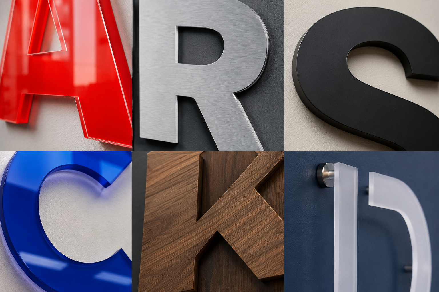
Material is the biggest single factor in how the sign looks, how long it holds up, and where it can go. Here is how the usual options stack up.
| Material | Look and feel | Strengths | Trade-offs | Typical use |
|---|---|---|---|---|
| Acrylic | Smooth and color-rich; gloss or matte | Light, comes in many colors and thicknesses, can be painted or printed to brand colors | Scratches more easily than metal; for sun exposure, exterior-grade or UV-stable stock matters | Interior lobby and reception signs; storefront signs where color is the point |
| Metal (aluminum, stainless, bronze, copper) | Substantial and architectural; brushed, polished, or anodized | Durable, weather-tolerant, refined; aluminum is lighter than steel | Heavier; often costs more per material, especially at larger sizes; may need specific hardware | Corporate and exterior building signage where a solid, lasting look is the goal |
| PVC | Clean and uniform; often painted | Light, easy to fabricate, paintable, easier on the budget | Less rigid than acrylic or metal; can warp in temperature extremes if not mounted well | Interior office signage and dimensional looks on a tighter budget |
| Wood / MDF | Natural, warm, or rustic | Distinctive texture; can be stained, painted, or clear-coated | Needs treatment for outdoor use; usually heavier | Cafes, specialty retail, and handcrafted-feeling brands, mostly indoors |
When you are choosing, two questions get you most of the way: what does the brand feel like, and where will the sign actually live? A brushed-metal wordmark reads one way in a financial office and another as a bright acrylic logo in a design studio. And an outdoor wall asks more of the material than a climate-controlled lobby does.
Flat cut versus dimensional letters
"Dimensional letters" is the umbrella term for any sign where the letters stand off the wall for a three-dimensional effect. Flat cut letters are one kind, made by cutting the shapes from a single solid sheet. Other approaches in the same family:
- Formed plastic letters, heated and molded into shape.
- Fabricated letters, built from multiple pieces with returns (the sides) that add depth, either hollow or solid.
People reach for flat cut letters when they want clean edges and a solid, precise face without the extra parts that come with lit styles.
Getting the most from a sign with no internal light
Since nothing lights up from inside, visibility comes down to design and placement. A few things that help:
- Lead with contrast. Pick a face color or finish that stands clearly against the wall behind it, like dark letters on a light surface or brushed metal on a matte background.
- Size for the viewing distance. The letters need to read from wherever people see them, whether that is a lobby doorway or across a sidewalk.
- Put them where they get seen. Mount at or above eye level in a spot that is not blocked, and think about glare and any landscaping or trim nearby.
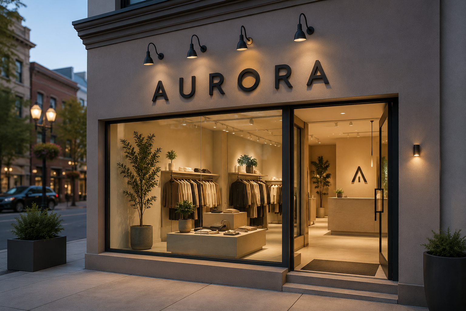
- Add external lighting outdoors. Spotlights or gooseneck fixtures keep an exterior sign visible after dark and play up its depth through shadow.
- Keep the font legible. Clear letterforms hold up at a distance better than very thin or ornate ones.
- Keep it clean. A well-kept sign holds its sharp look over time.
Mounting options
How the letters attach changes both the look and the install. The three common methods:
| Method | How it works | Visual effect | Considerations |
|---|---|---|---|
| Flush mount | Letters sit directly against the wall | Sleek and integrated | Secure and low-profile, with less shadow depth |
| Stand-off mount | Spacers hold the letters off the wall | Pronounced depth and shadow; letters can look like they float | Needs even spacing; dust can gather behind the letters over time |
| Pin mount | Small pins on the letter backs seat into drilled holes | Clean face with hardware often hidden; depth can vary | Requires accurate drilling and layout |
Before you order, it helps to have clear photos of the mounting surface plus its measurements. That lets a sign specialist suggest a material and mounting approach that suits the wall. Mounting details, surface prep, and any building or lease requirements are worth confirming with a qualified installer and your property manager ahead of time.
Preparing for an accurate quote
A good quote starts before you ask for one. Having a few things ready cuts down on back-and-forth:
- High-resolution vector logo files for anything beyond plain text.
- Rough dimensions, or the overall wall space you are working with.
- Material and finish preferences, even if you are still deciding.
- Photos of the wall or storefront, ideally straight-on and in daylight.
Because this is a visual call, it helps to see the letters in place before you commit. The Signage.com Design Studio can render flat cut letter concepts as a mockup, so you can preview size, spacing, and finish against your own space. Treat those mockups as a visualization aid for design decisions. Final engineering, fabrication, and installation details get worked out separately.
When you are ready, you can review styles and start a request on the flat cut letter signs collection.
FAQ
Do flat cut letter signs work outdoors? Many materials, including aluminum, stainless steel, and exterior-grade acrylic, hold up well outside. The right choice depends on your climate and exposure, so it is worth confirming the material specifics for your location.
Can flat cut letters be illuminated? Not from the inside; the letters have no built-in lighting. You can light them externally with spotlights or gooseneck fixtures, which also brings out their shadow depth at night.
How do they compare with channel letters on cost? Flat cut letters skip the internal electrical parts and lighting fabrication that channel letters need, so they usually involve fewer components. Actual cost depends on material, size, and finish.
What thickness options are there? Thickness varies by material, from thinner stock (around 1/8 inch) for some acrylic and metal up to an inch or more for certain acrylic, PVC, or foam. Thicker material reads as deeper and more substantial.
Can flat cut letters match a custom font or logo? Yes. Since the shapes are custom-cut, they can generally follow a specific font or logo, as long as you supply high-resolution vector artwork.
How do I get started? Gather your logo files, rough dimensions, material preferences, and photos of the wall, then browse and request options on the flat cut letter signs collection.
Before you order
Flat cut letter signs give an office or storefront a clean, dimensional brand mark without the parts that come with lit signage. Material and finish set the tone, the mounting method sets the depth, and placement and contrast keep it readable. Settle those choices, pull together your logo and wall details, and use a Design Studio mockup to preview the look. That gives you a well-specified sign that matches the business behind it.
