


A sign is often the first thing someone notices about a salon, spa, or barbershop, usually before they read a review or walk through the door. For beauty businesses, where the look and feel of a place is part of what you're selling, the sign has to pull double duty. It needs to fit the brand and stay easy to read from the sidewalk or the street.
Below is a walk through the practical decisions behind salon and beauty signage: sign types, materials, lighting, and placement. There's also a short list of what to gather before you ask for a quote, so you can browse the beauty signs collection with a clearer sense of what fits your space.
Key takeaways
- The sign shapes a first impression before anyone experiences your service.
- Style and legibility are separate problems. An elegant sign still has to read at a distance and after dark.
- Sign type sets the tone. Channel letters, lightbox signs, dimensional letters, blade signs, and LED neon each lean toward different looks and locations.
- Materials send brand signals. Acrylic, metal, and illuminated options look very different in person.
- Lighting extends the hours your storefront stays legible.
- Placement is a design choice, not an afterthought. Foot traffic, drive-by angles, the building itself, and property rules all factor in.
- A visual mockup, like Signage.com's Design Studio, helps you compare looks before you commit to fabrication.
Which sign types suit salons and beauty businesses
The right type depends on your aesthetic and where the sign will sit. A quiet skincare studio and a high-energy nail bar can both make sense of very different choices. Here's how the common options compare.
| Sign type | Look it tends to convey | Common fit |
|---|---|---|
| Halo-lit channel letters | Soft, upscale glow | Spas, higher-end salons |
| Front-lit channel letters | Bright, high-contrast, attention-forward | Busy streets, walk-in traffic |
| Lightbox (LED cabinet) signs | Bold, consistent, clean | Logos with solid shapes or color blocks |
| Dimensional letters (non-illuminated) | Crisp, tactile, understated | Interiors, well-lit facades, lobby signs |
| Blade signs | Visible from more than one direction | Dense urban blocks, pedestrian corridors |
| LED neon signs | Playful, artistic, retro-modern | Accent pieces, focal points, interior branding |
A few things worth knowing as you weigh those:
Channel letters are individual three-dimensional letters. Front-lit letters push light forward through a translucent face for strong legibility. Halo-lit (backlit) letters throw light onto the wall behind them for a softer effect. Combination-lit letters do both.
Lightbox signs are illuminated cabinets with a translucent face carrying your logo and text. They're a straightforward way to get an evenly lit, bold statement.
Dimensional letters cut from acrylic or metal give a clean look without internal lighting, and you can pair them with external spotlights.
Blade signs project out from the building, so people approaching from either direction can see them.
LED neon offers bright, energy-efficient color and custom shapes, which makes it a nice way to highlight a service or create a photo-friendly focal point. You can browse styles in the neon signs collection.
How materials and illumination affect style and visibility
Material and lighting together decide how a sign reads: its polish, its durability, and how it holds up outdoors. You want both working in daylight and after dark, because a design that looks great at noon can disappear at night.
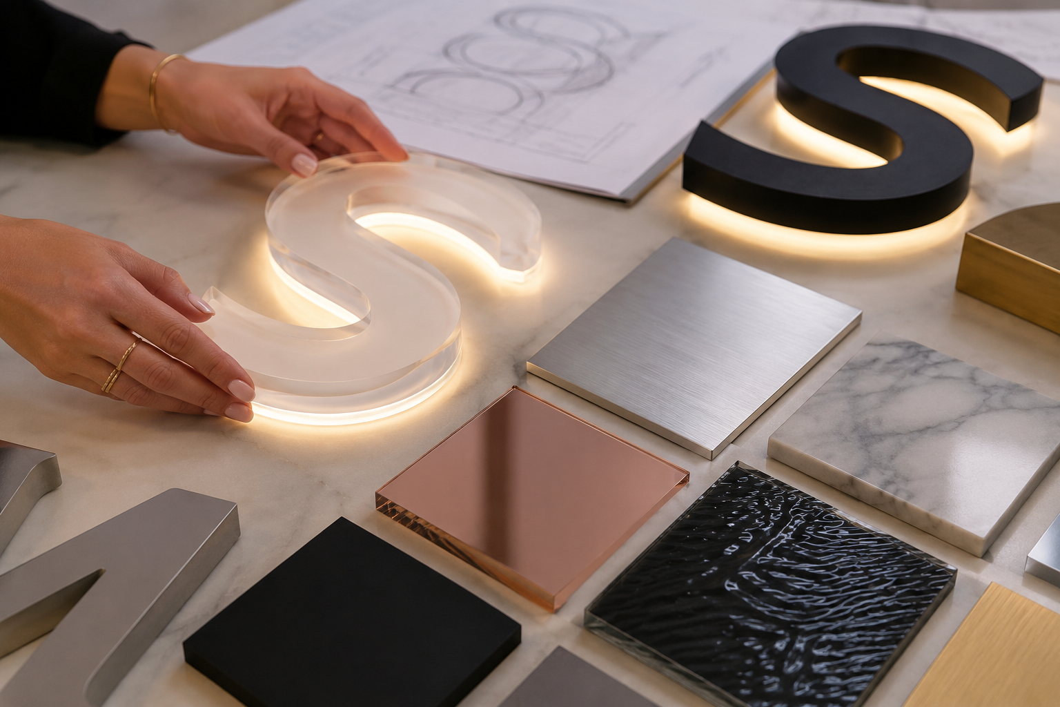
Materials
Acrylic is lightweight and comes in a lot of colors and finishes. It transmits light well, so it suits illuminated signs, and it tends to read as modern and clean.
Metal, meaning aluminum or stainless steel, carries a more high-end feel. Brushed or polished finishes suggest quality, and metal pairs with acrylic for illuminated effects. Aluminum resists rust and weighs less than steel.
Foam and PVC often show up in interior dimensional letters or non-illuminated indoor use. They're easy to shape, though they hold up less well outdoors than metal or acrylic.
Wood gives a natural, boutique feel for carved or dimensional signs. Outdoors it usually asks for more upkeep.
Illumination
Front-lit light shines through the face of the letters for strong brightness and color, which helps on busier streets.
Halo-lit, or backlit, throws light backward onto the mounting surface for a softer glow. Spas and upscale salons tend to favor it.
Open face leaves the light source visible, as with traditional neon tubing, for a distinctive retro look.
LED is standard on modern signs for its efficiency, long life, and steady output, and it comes in a range of color temperatures to match a brand.
The point is simple. A good-looking design still falls flat if the material fades or the lighting leaves it hard to see at night. Material and illumination aren't the last coat of polish; they're part of the design from the start.
Where salon signs should go
Even a well-made sign underperforms if it's tucked behind an awning or angled away from traffic. Placement is about being seen from every approach that matters: walking, driving, or looking for you on purpose.
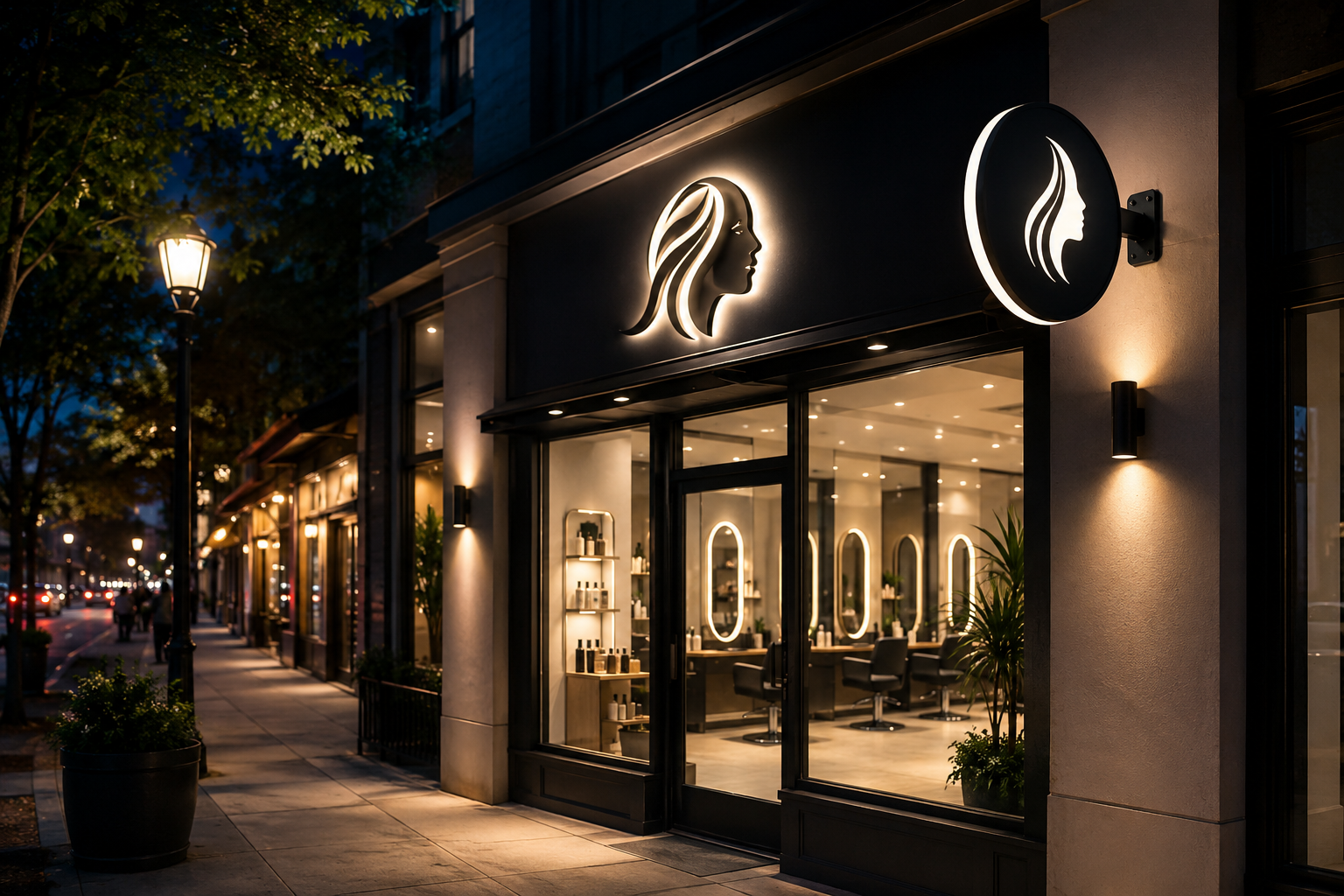
The storefront facade is the most common spot for a primary sign. Channel letters or a lightbox above the entrance or across the fascia work well, mounted at a height that clears awnings and other obstructions.
Blade signs project from the building, so they catch pedestrians coming from either direction and drivers who might miss a flat facade sign. They earn their keep on dense blocks.
Window signage, whether vinyl or cut graphics on the glass, can carry hours, services, or promotions and back up the main sign without replacing it.
Monument or freestanding signs help when your salon sits in a plaza or set back from the road. A lower freestanding sign near the entrance improves visibility from a distance.
Interior signs matter once clients are inside. A reception or lobby sign reinforces the brand, and dimensional letters or acrylic panels on standoffs look polished behind a front desk.
One practical check before you lock in placement: think about viewing distance and speed. What reads clearly to someone on foot may be a blur to a car passing at 40 mph, so size and letter weight should match how people actually come across the sign.
How signage supports customer confidence
A sign is a visual trust signal. A crisp, well-kept storefront suggests a business that cares about how it presents itself, and clients often read that as a hint about the care they'll get inside.
A clean, well-executed sign reads as attention to detail. Quality signage suggests an established business, while temporary-looking or neglected signs can chip away at that. Matching colors, fonts, and logos across the sign and interior make a business easier to recognize and remember. An easy-to-read sign helps clients find you without friction, which sets a good tone before they arrive. And refined materials and lighting, like halo-lit letters or polished metal, can line your storefront up with what clients seeking premium services expect.
A faded or crooked sign can make an otherwise sharp storefront feel neglected. Keeping signage clean and in good repair protects an impression you've already paid for.
What to prepare before requesting a salon sign quote
Signage is a custom, visual purchase, so the more detail you bring, the more specific a quote can be. Having these ready helps a sign shop understand your space and what you're after:
- Business type, whether salon, spa, barbershop, nail bar, or another beauty concept.
- Logo and brand assets, ideally high-resolution vector files (AI, EPS, PDF) plus your brand colors and fonts.
- The sign type you're leaning toward: channel letters (front- or halo-lit), lightbox, dimensional letters, blade sign, or a combination.
- Location details: indoor or outdoor, photos of the spot from a few angles, the mounting surface (brick, stucco, glass, metal siding), and rough measurements of the available space.
- Lighting needs, meaning whether you want illumination and in what style.
- Any material preferences you already have in mind.
- A target timeline, if you have one.
- Property rules, including any known restrictions from a landlord or property management.
- Open questions, such as notes on permits or installation you'd like to talk through.
Signage.com's Design Studio can help at this stage. It's an AI-assisted mockup tool for comparing visual options, things like letter style, color, illumination type, and scale, so you can start the quote conversation with a clearer picture. Keep in mind it's a way to explore looks, not final engineering, fabrication, permitting, or installation documentation.
Frequently asked questions
Which materials tend to hold up outdoors? Aluminum and acrylic are common choices for exterior salon signs. Aluminum resists rust and weathering, and acrylic is UV-resistant and works well for illuminated designs.
How much does lighting matter for a beauty business? Lighting keeps your storefront legible into the evening, extends the hours the sign is visible, and adds to a welcoming impression after dark.
Can I preview my sign before ordering? Yes. Signage.com's Design Studio offers an AI-assisted visual mockup, so you can explore concepts and compare options before moving to a formal quote.
Do salon signs need a permit? Many outdoor and illuminated business signs require local permits. Requirements vary by city and county, so check with your local planning department before ordering.
How can my sign stand out on a busy block? A few options: front-lit channel letters for brightness, a projecting blade sign for multi-directional visibility, and a design that leans into your brand's colors and style.
What's the difference between front-lit and halo-lit channel letters? Front-lit letters glow through the face for direct brightness. Halo-lit (backlit) letters cast a soft light onto the wall behind them for a more understated effect.
Where to start
Your salon's sign goes to work before your services do, shaping first impressions and hinting at the quality clients can expect. Picking the right sign type, durable materials, good lighting, and smart placement is what turns a nice design into one people actually notice and remember.
When you're ready to look at options, browse the beauty signs collection for styles suited to salons, spas, and studios, or the neon signs collection if you want a bolder accent. Design Studio can help you picture how each might look on your storefront.
