


Your storefront sign is usually the first thing a customer notices, often before they've read a review, checked your hours, or stepped inside. Picking a retail sign is less about the look you like and more about matching a sign type to how your space actually gets seen: from the sidewalk, from a passing car, in daylight, and after dark.
This guide walks through the common retail sign types, how materials and lighting change the result, what to have ready before you request a custom sign quote, and how indoor signage carries the same brand once customers are through the door.
Key takeaways
- Pick a sign type based on how and when people approach your storefront, not appearance alone.
- Channel letters, lightboxes, dimensional letters, and blade signs each solve different visibility and branding problems.
- Acrylic, metal, and PVC, plus whether a sign is lit, affect how it looks and how it reads day versus night.
- Landlord requirements and municipal sign rules can shape what's allowed, so check them early.
- Keep indoor and outdoor signs consistent so customers can navigate once inside.
- A tool like the Signage.com Design Studio lets you preview options on your own storefront before production.
Main types of retail store signs, and when each one fits
Each sign type has a different strength. Some are built for nighttime visibility, others suit foot traffic or road-facing locations. The right pick depends on your storefront, your brand, and where your customers come from.
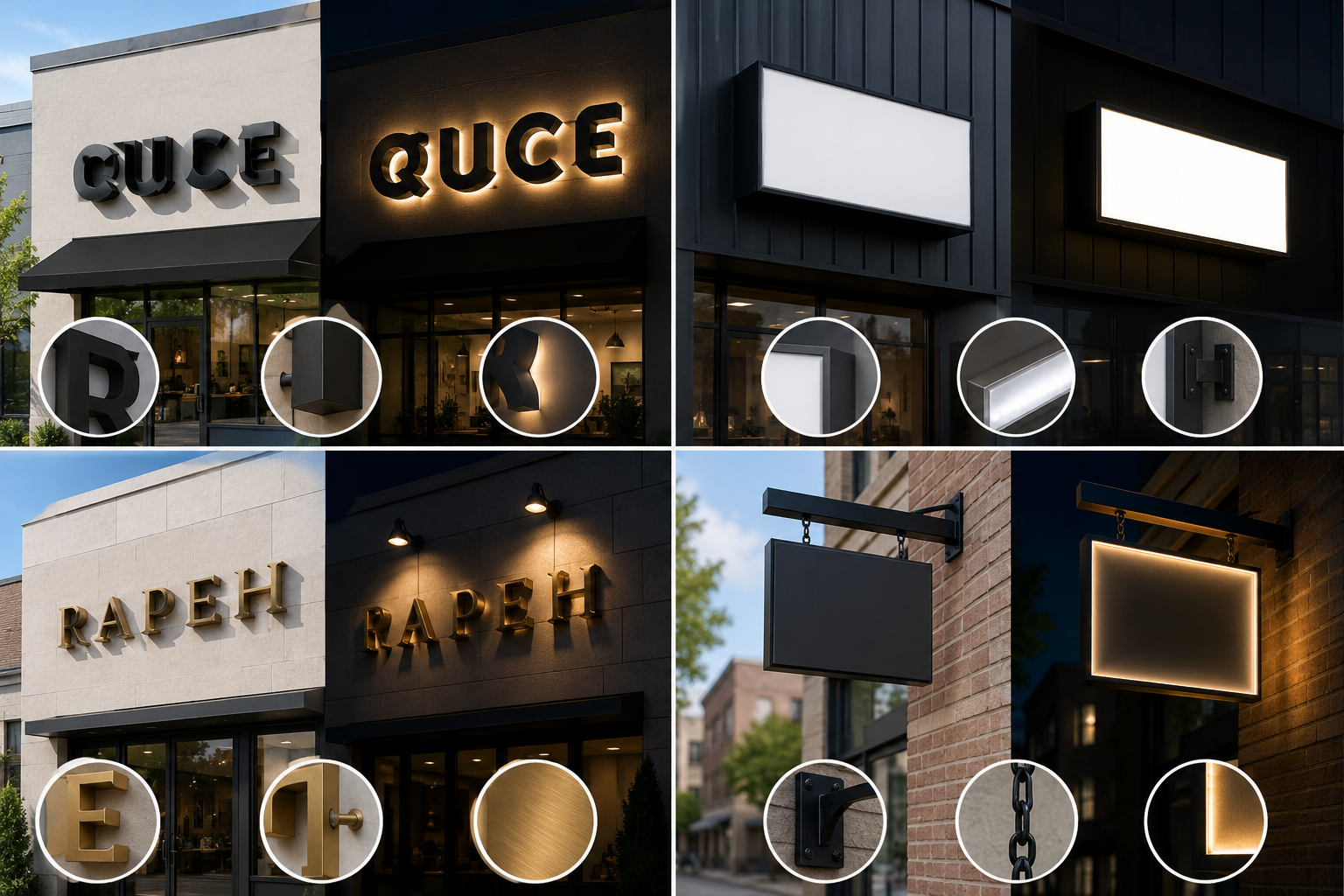
| Sign type | What it is | Consider it when |
|---|---|---|
| Channel letters | Individual 3D letters and logos, commonly aluminum and acrylic, often illuminated | You want day-and-night visibility and a dimensional storefront presence |
| Lightbox (LED cabinet) | An illuminated cabinet with a translucent, printed face | You have a detailed logo or design and want an evenly lit, uniform display |
| Dimensional / flat-cut letters | Non-illuminated letters cut from acrylic, metal, or PVC | You have good ambient lighting, or you're branding an interior lobby or reception area |
| Blade sign | A sign projecting out from the facade, readable down the street | You're in a walkable area and want to be seen from the side, not just head-on |
| Monument sign | A low, ground-level sign near an entrance, separate from the building | You need property identification at a driveway, campus, or multi-tenant entrance |
| Pylon sign | A tall, freestanding pole-mounted sign | Your location sits back from the road or needs to be seen from a distance |
Channel letters, in more detail
Channel letters are a common retail choice largely because of how they handle light:
- Front-lit letters push light forward through an acrylic face for a bright, direct look after dark.
- Halo-lit (also called reverse-lit) letters glow from behind against the mounting surface, a softer effect that tends to suit professional or upscale settings.
- Combination-lit letters mix both.
One mistake worth avoiding: choosing a sign purely on looks without thinking about how it reads at night or what your location allows. Landlord requirements and local sign rules vary a lot, so it pays to understand them before you lock in a type or size.
How materials, lighting, and placement affect visibility and trust
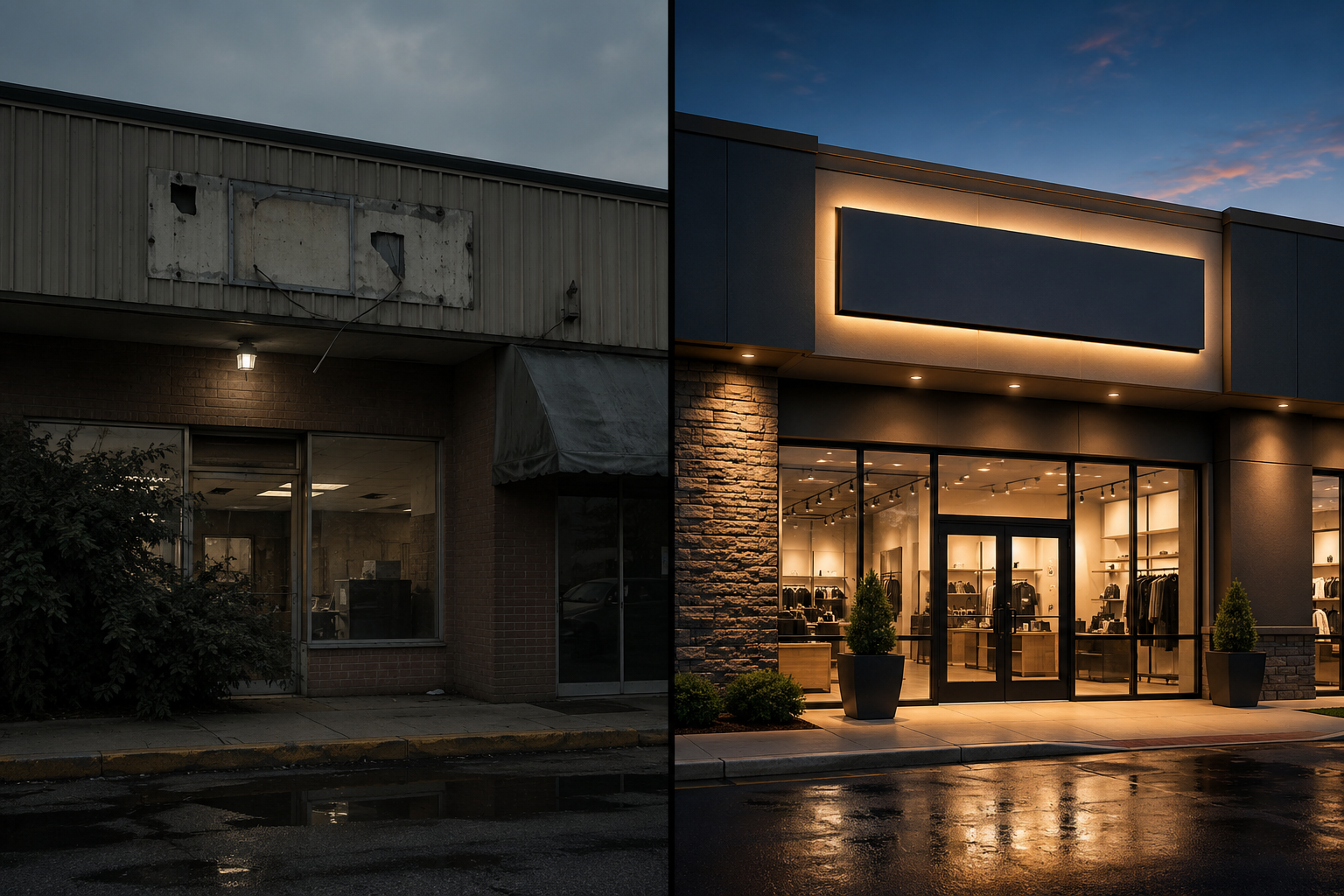
Materials, lighting, and placement do more than set the aesthetic. They decide whether your sign is legible, how well it holds up, and what impression it leaves. A worn or poorly lit sign can make a storefront look neglected. A clean, well-lit one suggests the business behind it is open and looked after.
Materials
- Acrylic: widely used for illuminated signs because it diffuses light well, and it comes in many colors and finishes for a clean, modern look.
- Metal (aluminum, stainless steel, bronze): durable with a high-end feel. Metal dimensional letters are common where an architectural, upscale appearance is the goal.
- PVC and foam: lighter and more economical, suited to interior signs or non-illuminated uses. Generally less durable outdoors than metal or acrylic.
Lighting
- Front-lit: bright and direct, helpful for evening hours or busy streets.
- Halo or reverse-lit: a softer glow with a more understated, architectural feel.
- No illumination: relies on daylight or nearby light. A fit for well-lit areas or daytime-focused businesses.
A sign that goes dark in a dim location can read as "closed" even when you're open, so match the lighting to your hours and surroundings.
Placement
- Fascia, above the entrance: the standard spot for primary storefront identification.
- Projecting (blade): catches people approaching from the side, on foot or in a car.
- Ground level (monument): property identification at the entrance of a larger site.
- Window or door: useful for hours and promotions, but best as a supplement to a primary sign, not a replacement.
If your business operates past daylight hours, lean toward materials and lighting that keep you visible after dark, and pick placement that stays clear of trees, awnings, or neighboring structures. Signage is one piece of a wider storefront and marketing presence. The U.S. Small Business Administration's guide to marketing and sales has useful context on how these pieces fit together.
Getting ready for a custom retail sign quote
A useful quote starts before you ask for one. The more your sign partner knows about your brand and location, the more the first proposal reflects your actual space instead of a generic estimate.
To request an accurate custom sign quote, it helps to gather:
- Brand assets: logo files (vector formats like AI, EPS, or PDF are ideal), brand colors, and a short note on the look you're after.
- Location photos: clear shots of the storefront or interior wall where the sign will go, from a few distances and angles.
- Sign type or ideas: even a rough direction, like channel letters or a lightbox, narrows things down.
- Approximate size: rough measurements of the available area help with scale and fit.
- Indoor or outdoor use: this shapes material and lighting choices.
- Lighting preference: front-lit, halo-lit, or none.
- Material preference: any leanings toward acrylic, metal, or another finish.
- Mounting surface: brick, stucco, metal panel, drywall, and so on.
- General timing: an ideal target window, with the understanding that firm dates come later.
- Known constraints: any landlord rules or local requirements you already know about.
Sending these details up front cuts down the back-and-forth and helps the first proposal line up with your space. The Signage.com Design Studio can also help you picture concepts while you pull this together. Treat it as a preview aid for look and scale, not a substitute for final engineering, permitting, or fabrication documents.
How visual mockups help you decide
Signage is a physical, visual purchase, and it's hard to judge from a spec sheet. A mockup lets you see a sign on your actual building or wall before anything gets produced.
A mockup tool like the Signage.com Design Studio can help you:
- See scale and fit, so your logo and sign type sit in proportion to the storefront and nothing ends up too small, too large, or awkwardly placed.
- Compare options by swapping fonts, colors, lighting styles, and finishes side by side.
- Get a feel for visibility by previewing how a design might read at different times of day.
- Make a big decision feel more concrete, and make internal sign-off or a landlord's review easier to move through.
Say you're weighing front-lit channel letters against halo-lit dimensional letters for a boutique. Uploading a photo of your storefront and rendering both on the building makes the tradeoff much easier to see than imagining it. Keep in mind that a mockup is a visualization aid. Final production still depends on site-specific engineering and any required approvals.
Indoor retail signs: carrying the brand inside
Exterior signs bring customers in. Interior signs continue the experience, help people find their way, and repeat the same brand once they're through the door.
- Lobby signs: often dimensional or acrylic letters with standoffs, setting a professional tone at a reception area or entrance.
- Wayfinding signs: pointing customers toward departments, fitting rooms, restrooms, or checkout, which helps in larger or multi-area stores. Some interior and directional signage is subject to accessibility requirements that vary by location.
- Menu boards: for cafes, restaurants, and food businesses, as illuminated lightboxes, digital screens, or flat-cut letters.
- Promotional signs: highlighting sales, new arrivals, or seasonal offers.
- Safety and information signs: exit, restroom, and occupancy signage tied to local requirements.
For a cohesive result, keep interior signs consistent with your exterior signs in font, color, and overall style. That continuity is part of what makes a storefront and its interior feel like one space rather than two disconnected ones.
Where to start
Picking a retail sign comes down to a few plain questions. How and when will people see it? What impression should it make? What do your location and landlord allow? Illuminated channel letters built for day-and-night visibility answer those differently than understated dimensional letters for an interior lobby.
Weigh materials, lighting, and placement against your specific storefront, keep your indoor and outdoor signs consistent, and use a mockup to preview options before committing. When you're ready to explore designs or request a detailed quote, having your logo files, location photos, and a clear direction on hand keeps things moving. You can start with the retail sign collection or browse outdoor sign options to see what fits.
FAQ
Which retail sign types are commonly used? Channel letters, often front-lit, and lightbox signs are popular for retail because they stay visible after dark. Dimensional letters are a common pick for a more understated, non-illuminated look, indoors or out.
How do I know what size sign my store needs? Sizing depends on your facade dimensions, how far away people view the sign from, and local sign rules. A mockup, such as one from the Signage.com Design Studio, can help you picture appropriate scale on your own storefront before you finalize.
Do retail store signs require permits? Many outdoor signs are subject to local permit requirements that vary by municipality and can depend on sign type, size, and location. It's worth checking your local rules and any landlord requirements early. A sign company can often help you understand what documentation may be involved.
What's the difference between front-lit and halo-lit channel letters? Front-lit letters shine light forward through the face for a bright, direct look. Halo-lit (reverse-lit) letters glow from behind against the mounting surface, a softer, more understated effect.
How does signage affect customer perception? Clean, well-maintained, clearly lit signage tends to read as an active, cared-for business. Faded, broken, or dark signage can give the opposite impression, even when everything inside is running well.
Can I get a quote and a mockup for my retail sign? Yes. Signage.com offers custom quotes and visual mockup support through the Design Studio. Sharing your logo files, location photos, and preferred sign type helps produce a preview and a quote suited to your space.
