


Your office sign is often the first thing a buyer or seller notices, usually before they read a review, visit your website, or talk to an agent. For a real estate office, that first look does some work for you. It signals that you have a settled, professional presence in the neighborhood you serve.
This guide covers the sign types most real estate offices look at, how to weigh outdoor against indoor signage, and what to pull together before you ask for a quote.
Key takeaways
- An office sign is a visible branding asset that helps communicate professionalism and a local presence.
- Readability from a distance, in daylight and after dark, is a core design consideration.
- Common choices include channel letters, lightbox (cabinet) signs, monument signs, blade signs, and dimensional letters. Each suits different buildings and goals.
- Materials and illumination affect durability, appearance, and low-light visibility.
- Site-specific factors like landlord agreements, local rules, and building architecture shape what is feasible. Confirm these with your property manager and local authorities early.
- A visual mockup helps you check design, scale, and placement before you commit to production.
- Indoor signs extend your branding and help visitors find their way around.
Why office signage matters for real estate branding
A real estate office sign is a physical extension of your brand. Since so much of the business runs on trust and familiarity, the way your storefront presents itself shapes what a prospect expects before anyone says a word.
Put a storefront with faded, generic lettering next to one with crisp, well-lit dimensional or channel letters. The second one reads as an active business that pays attention to detail, and that impression tends to carry over to how people expect you to handle a transaction. Signage that stays consistent and well maintained reinforces recognition every time someone passes by.
What makes a real estate sign work
Legibility comes first. Clear fonts and strong contrast help the sign read from a distance and from a moving car. Beyond that, matching the sign to your logo and colors keeps your branding cohesive across everything a client sees.
Material matters too. Acrylic and metal, common in dimensional and channel letters, are chosen for a lasting look. Illumination (front-lit, halo-lit, or cabinet lighting) keeps branding visible after dark. And placement decides who actually sees it: facade signs, a monument sign, and a blade sign each catch different sightlines and traffic patterns.
Sign types to consider
The right type depends on your building, your street, and the look you are after. For a real estate office, visibility usually means being easy to spot from both car and foot traffic, day or night. Here is a quick rundown of the common options.
| Sign type | What it is | Consider it if |
|---|---|---|
| Channel letters | Individual dimensional letters, often internally lit with LEDs | You want a distinctive, illuminated storefront presence |
| Lightbox / cabinet signs | Illuminated cabinet with a translucent branded face | You want consistent illumination and a solid background for your logo |
| Monument signs | Ground-level freestanding signs in masonry or metal | You have a larger property or a set-back entrance |
| Blade signs | Signs mounted perpendicular to the facade | Your office sits on a sidewalk with foot traffic |
| Dimensional letters | Flat-cut, non-illuminated letters in acrylic, metal, or PVC | You prefer a clean, understated look indoors or on a well-lit exterior |
Illuminated options like channel letters and lightbox signs keep branding visible in the evening, which matters more if your office keeps later hours. Non-illuminated dimensional letters give a quieter, refined look that works well for lobbies and daytime-facing exteriors. You can browse exterior options under outdoor signs.
Planning an outdoor sign
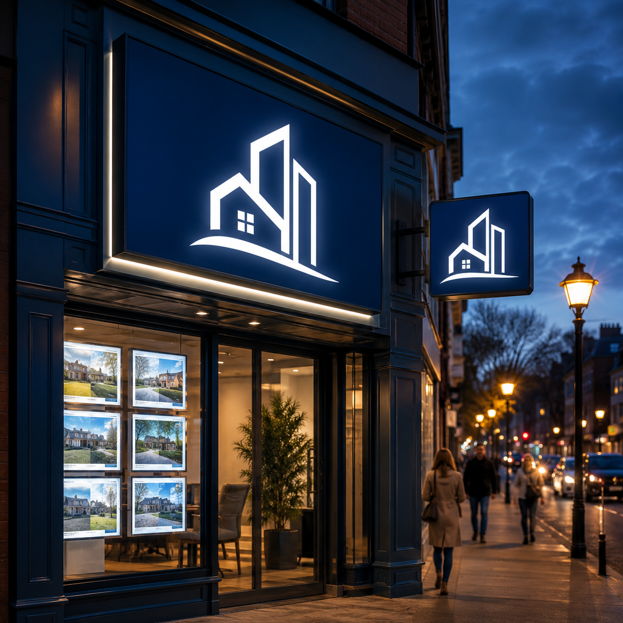
Outdoor signage brings in practical factors past the design itself. Your facade shapes how a sign can mount. Local rules and landlord or property-management agreements may limit size, projection, and lighting. Weather exposure affects which materials hold up. Sorting these out early saves you from redoing things later.
Outdoor planning checklist
- Local rules and approvals. Size, placement, and illumination are often governed by city ordinances, landlord agreements, and property-management guidelines. Confirm the requirements with the relevant authorities and your property manager before you lock in a design.
- Facade and mounting. Note the building material (brick, stucco, metal, glass) and how much room you actually have for the sign you are considering.
- Visibility and legibility. Think through the viewing distances and angles, whether that is a busy road, a quiet sidewalk, or both.
- Lighting. Decide whether you want illumination and which effect (front-lit, halo-lit, internal LED) fits your hours and setting.
- Materials. Weather-resistant materials such as aluminum and acrylic are common picks for exterior durability.
- Brand fit. Make sure the sign reflects your agency and suits the building's architecture.
Signage inside the office
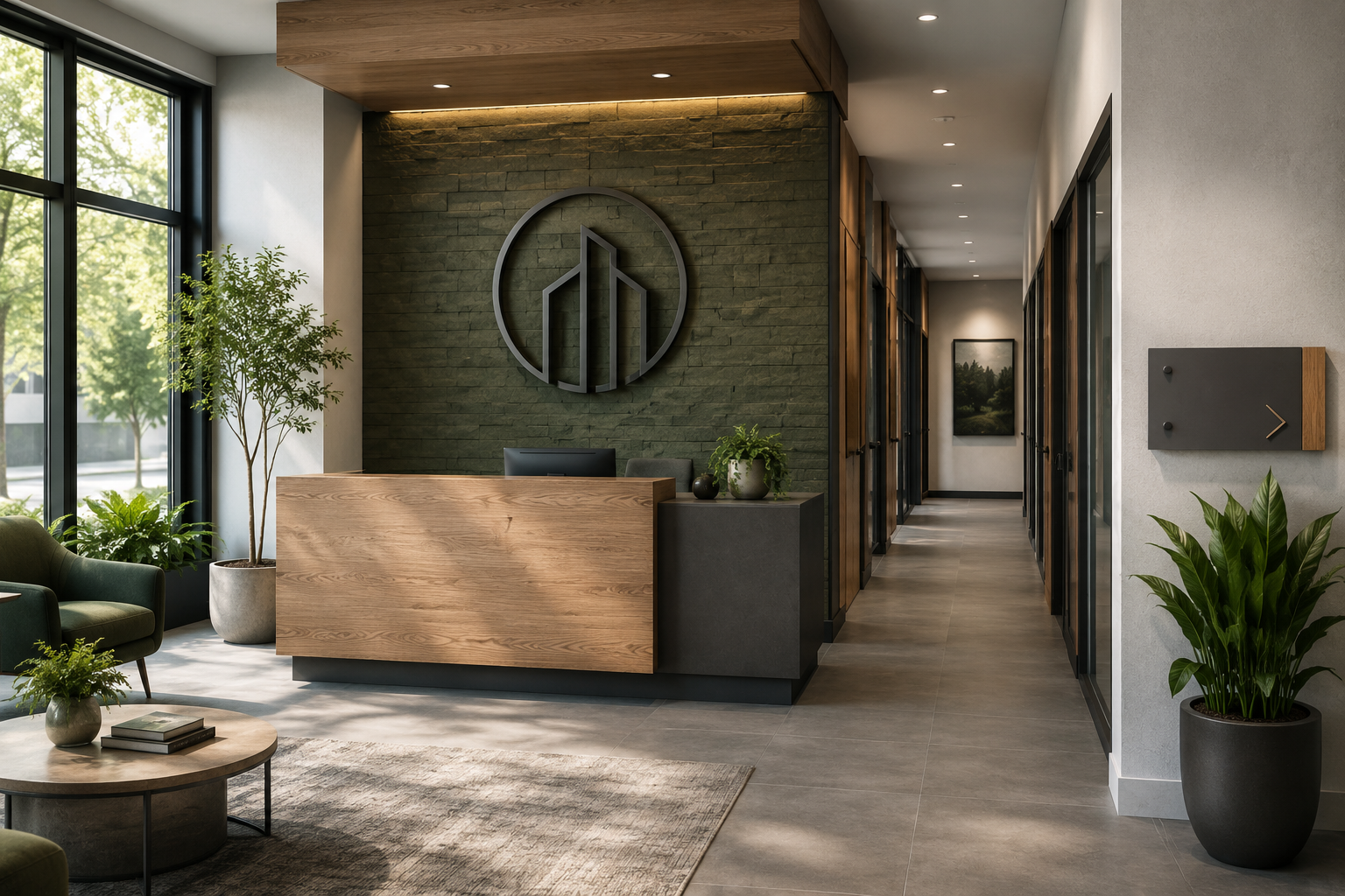
Once clients step inside, indoor signage carries the branding through and helps people find their way. A lobby sign, often dimensional letters or an acrylic sign with your logo, gives reception a focal point. Wayfinding signs then guide visitors to offices, meeting rooms, and other areas.
A few common pieces:
- Lobby signs: dimensional or acrylic signs showing your agency name and logo at the entrance.
- Wayfinding signs: directional signage for reception, agent offices, and conference rooms.
- Wall graphics: subtle branded graphics that set the tone of the office.
- Door signs: signage for individual offices and meeting rooms.
- Display signs: spots to feature listings, agent profiles, or announcements.
Explore interior options under indoor signs.
How to prepare for a quote
A useful quote starts with clear, specific inputs. The more detail you share up front about your branding, location, and preferences, the smoother the conversation goes.
What to gather
- Sign type you are interested in: channel letters, lightbox, dimensional letters, monument, or a mix.
- Location: outdoor storefront, interior lobby, or both.
- Brand assets: high-resolution or vector logo files (AI, EPS, PDF) and any brand guidelines.
- Approximate dimensions: the width and height you have in mind.
- Mounting surface: building material or interior wall type.
- Lighting preference: whether you want illumination and the effect you are after.
- Material preferences: anything specific you already have in mind.
- Site photos: clear photos of where the sign will go.
- Open questions: anything you want to talk through on placement, timing, installation, or local requirements.
To help you picture options before you commit, Signage.com offers a Design Studio mockup tool. It lets you preview how different sign styles, colors, and illumination might look, so you can compare scale and placement with more confidence. Treat these previews as a visual aid for exploring ideas. Final specifications, fabrication details, permitting, and installation are handled separately as part of your project. When you are ready to start the conversation, visit the Signage.com quote page.
Where signs are made
Signage.com produces many of its signs at its Philadelphia facility. The specifics can vary by product and project, so it is worth confirming the details for the sign type you choose during your quote conversation.
FAQ
Which sign type works best for a real estate office?
It depends on your building and street. Channel letters and lightbox signs give strong illuminated visibility, monument signs suit set-back or larger properties, and dimensional letters give a clean, understated look indoors or out.
How can I keep my office sign visible after dark?
Illuminated options like front-lit or halo-lit channel letters, or LED cabinet (lightbox) signs, help keep branding readable in low light. The right choice comes down to your hours and surroundings.
Can I preview my sign before ordering?
Yes. Signage.com's Design Studio lets you mock up sign styles, colors, and illumination as a visual aid, so you can compare options before you start the quote process.
What do I need for a custom sign quote?
Usually your logo files, approximate dimensions, photos of the site, your preferred sign type and materials, and any lighting preferences. More detail generally makes for a more useful conversation.
Are there rules I should check for office signage?
Often, yes. Local ordinances, landlord agreements, and property-management guidelines can affect size, placement, materials, and lighting. Confirm these with the relevant authorities and your property manager before you finalize a design.
How important is brand consistency for my sign?
It helps. Lining up your sign with your logo, colors, and other materials supports recognition and a cohesive, professional look.
