


Your exterior sign does work before anyone touches a dumbbell. It tells a passing driver or walker that you exist, where the door is, and roughly what to expect inside. A clear, well-lit sign reads as a business that pays attention. A faded or dark one raises questions you would rather not answer for free.
This guide covers the sign types that fit fitness spaces, how lighting and placement affect visibility, which materials tend to hold up outdoors, and a few design mistakes worth avoiding. It is written for owners who are actually choosing signage right now.
Key takeaways
- Your exterior sign is often a first touchpoint. Plenty of prospective members see it before your website, your reviews, or your front desk.
- Visibility is about more than size. Lighting, contrast, placement, and sightlines all decide whether the sign gets read, day and night.
- Sign type should match your brand. A high-intensity training gym and a boutique yoga studio usually call for different letter styles and lighting.
- Materials change how a sign ages. Aluminum, acrylic, and stainless steel are common outdoor choices for good reasons.
- Lighting carries extra weight for gyms, since early-morning and late-evening hours mean the sign is often seen in the dark.
- Local rules apply. Zoning, building codes, landlord agreements, and permit requirements vary by location, so confirm them before you commit to a design.
- A mockup cuts down on guesswork. Seeing a concept on your building before you order makes the decision easier.
Why gym signs shape first impressions
For a lot of prospective members, the exterior sign is the first contact they have with your brand. Someone new to the area, driving past and half-looking for a place to train, forms a quick read: Is this place open? Is it kept up? Does it look like somewhere I would want to spend time?
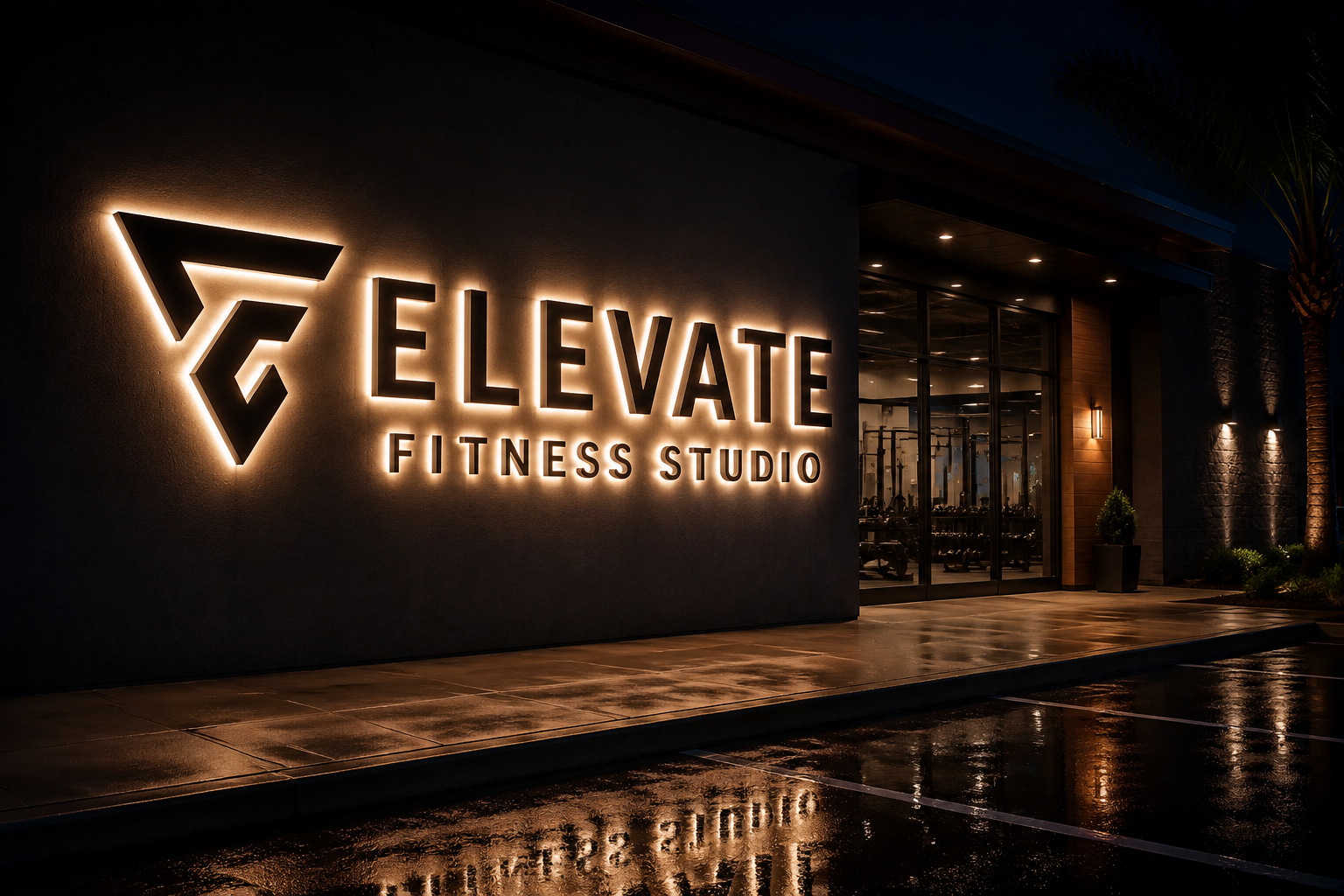
A legible, well-lit sign supports the idea of a facility run with care. One that is faded, cracked, or dark after hours can suggest the opposite, fair or not. For a category built around energy and cleanliness, the sign is one more signal that either backs those qualities up or works against them.
Choosing the right sign type for your gym
Different sign types solve different problems. The right pick depends on your location, how traffic approaches the building, and the impression you want to set. Here is how the common options tend to compare for fitness spaces.
| Sign type | Best for | Typical fit |
|---|---|---|
| Channel letters (front-lit) | Strong day and night readability from the street | High-traffic roadside gyms |
| Channel letters (halo-lit) | A softer, glowing, modern look | Boutique studios, upscale gyms |
| Lightbox / LED cabinet signs | Even illumination and detailed logos | Complex logos, multi-color marks |
| Dimensional letters (non-lit) | A clean, tactile look where light is already available | Lobby signs, well-lit exteriors |
| Blade / projecting signs | Catching foot traffic from both directions | Sidewalk-facing or dense retail strips |
| Monument signs | Ground-level presence at a property entrance | Multi-tenant plazas, larger sites |
| Pylon signs | Long-distance visibility from a roadway | Commercial parks, set-back buildings |
A few notes on the choices gyms reach for most:
Channel letters are individual illuminated letters. You can get them front-lit (light through the face), halo-lit (a glow behind each letter), or a mix. They are easy to customize in font, color, and size, which is why they suit a lot of gyms.
Lightbox signs use an illuminated cabinet with a translucent face. They handle detailed or multi-color logos well and stay evenly bright.
Dimensional letters are non-illuminated shapes cut from acrylic, metal, or PVC and mounted to the wall. They read clean where there is enough ambient or external light, and they work well for interior lobby signage.
A high-volume training gym might lean toward large front-lit channel letters for street readability. A quieter studio might prefer halo-lit or dimensional letters for something more understated. You can compare illuminated and outdoor options in the outdoor signs collection.
Lighting and placement for visibility
Gyms often run early mornings and late evenings, so the sign gets seen in low light or full dark a lot of the time. That makes lighting and placement more than cosmetic.
On lighting, front-lit letters push light through the face for brightness and legibility, which is a common pick for roadside visibility. Halo-lit letters glow from behind for a softer effect, often used by boutique brands. Combination-lit letters blend both. Neon and LED neon can add character and suit retro or high-intensity concepts, and you can browse styles in the neon signs collection. External lighting, like gooseneck or flood fixtures, lights up non-lit dimensional or flat signs.
Placement is its own set of tradeoffs:
- Height and scale. Set the sign high enough to clear parked cars and pedestrians, and size it to the building and the distance people view it from.
- Sightlines. Check the view from the street, the parking lot, and walking approaches. Trees, awnings, and neighboring signs can block something that looked fine on paper.
- Traffic flow. Position it so it can be read at the speed and angle people actually pass.
- Building fit. A sign that works with the facade's lines and colors reads as intentional rather than tacked on.
- Local rules. Size, type, lighting, and placement can be governed by zoning, building codes, and landlord agreements. Confirm what applies to your location before you finalize anything.
Materials and durability for outdoor signs
Outdoor signs take sun, rain, temperature swings, and the occasional bump at street level. Material choice affects how well a sign keeps its finish and shape over time.
- Aluminum is lightweight and rust-resistant, and it shows up in channel letters, dimensional letters, and cabinet frames. It takes paint and brushed finishes well.
- Acrylic is weather-resistant, comes in many colors and opacities, and transmits light, which makes it useful for illuminated faces and lightboxes.
- Stainless steel gives a sleek, corrosion-resistant look for dimensional letters and can be brushed, polished, or painted.
- PVC is a lighter, lower-cost option for dimensional letters, though it may not match metal or acrylic for longevity in harsher conditions.
Past the base material, ask about UV-stable paints and finishes to limit fading, weather resistance for your climate, and how easy the sign is to clean. Higher-grade materials can cost more up front and may reduce upkeep later, but that depends on the specific product, finish, and conditions.
Design mistakes to avoid
A handful of issues undercut otherwise good signs:
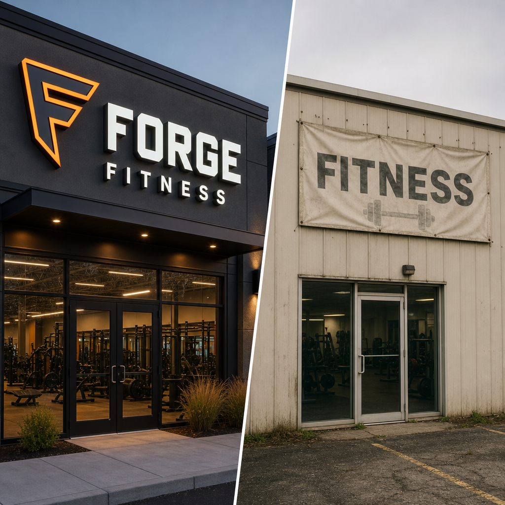
- Weak contrast. Colors that blend into the building or the sky are hard to read at a distance or at speed. Favor high-contrast pairings.
- Fussy fonts. Thin or ornate typefaces lose legibility from far off. Keep the primary text clear and bold.
- Too much information. An exterior sign usually needs the name and maybe a short tagline, not a service list or hours.
- Wrong scale. Too small and it gets missed; too large and it looks out of place. Match it to the facade and viewing distance.
- No light where it is needed. For non-traditional hours, an unlit sign after dark can read as closed.
- Inconsistent branding. Exterior colors and fonts that do not match your interior, website, and marketing weaken recognition.
- Deferred maintenance. Fading, grime, and burnt-out lighting send a neglect signal. Routine cleaning and prompt repairs protect the impression.
- Skipping a preview. Guessing how a design will sit on your building is avoidable. A mockup lets you test size, color, and placement first.
Previewing a design before you order
Committing to a custom sign is a visual call, and it is hard to judge from a spec sheet. Will the letters read cleanly? Will the color hold up against the facade? How big should it actually be?
Signage.com's Design Studio is a visual mockup aid. It renders a proposed sign concept onto a photo of your building, so you can compare letter styles, colors, lighting approaches, and sizes before you ask for a quote. It is for exploring and refining the look, not final engineering, fabrication, permitting, installation, or code-compliance documentation, which are handled separately.
Used that way, a mockup helps you see the sign in context on your own storefront instead of imagining it, compare options like front-lit versus halo-lit side by side, judge scale and placement so nothing ends up too small or awkward, refine the concept until it fits, and walk into the quote conversation with clearer requirements.
Wrapping up
Signage is part of your brand, not just a marker on the wall. Matching the sign type to your space, picking durable materials, planning lighting and placement around your hours, and steering clear of the common mistakes all help the sign earn its keep. Previewing a concept with a mockup adds one more bit of confidence before you order.
FAQ
How much does lighting matter for a gym's outdoor sign? Usually quite a bit, since many gyms open early and close late. Lighting keeps the sign visible in low light and signals that the business is active during those hours.
What are channel letter signs, and do they suit gyms? Channel letters are individual, often illuminated letters or logo shapes. They fit a lot of gyms because they are easy to customize in font, color, and size, and they can be lit for day and night readability.
How do I make my gym sign readable from a distance? Clear, bold fonts, high-contrast colors, the right scale, and enough light all help. Placement that accounts for traffic flow and sightline obstructions matters too.
Do I need a permit for a new gym sign? It depends on your location. Many outdoor signs fall under local zoning and building codes, and landlord agreements may apply as well. Confirm what is required in your area before you finalize a design.
What is the benefit of a mockup tool like the Design Studio? It lets you see a sign concept on a photo of your building so you can weigh size, placement, color, and lighting before ordering. It is a preview aid, not final engineering or permitting documentation.
Which materials are common for durable outdoor gym signs? Aluminum, acrylic, and stainless steel come up often outdoors for their weather resistance and finish options, with PVC as a lighter, lower-cost alternative.
