


For a lot of businesses in New Jersey, the storefront sign is the first thing a customer registers, before the product, the service, or anyone on your team. A sign that is planned well does a few practical jobs: it helps people find you, tells them what you do, and sets the impression you make from the sidewalk or the road.
This guide covers the sign types worth considering, how materials and lighting change the way a sign performs, what to pull together before you ask for a quote, and where a visual mockup helps. If you already know what you want, you can start a free quote or look at custom business sign options.
Key takeaways
- Visibility usually decides it. The sign has to read clearly from the angles and distances people actually approach from, in daylight and after dark.
- A sign is a trust signal. Clean and well-lit reads as professional; faded or half-broken works against you.
- Material and lighting change how it holds up, including how the sign takes New Jersey's seasonal weather.
- Landlord rules and local codes matter. Type, size, placement, and lighting are often governed by property management guidelines and municipal ordinances, so confirm them early.
- Coming prepared speeds up quoting. Logo files, dimensions, and location photos on hand lead to more accurate quotes.
- A mockup lowers the guesswork. Previewing a sign on a photo of your building helps you judge scale and placement before anything is built.
- Interior signage counts too. Lobby signs, wayfinding, and ADA signage round out the experience.
Why the sign is more than a nameplate
A custom sign is a standing version of your brand that works whether or not anyone is in the shop. Long before a customer talks to you, it tells them whether the business looks established, cared for, and worth walking into.
The reverse holds. A dim lightbox, peeling letters, or a logo you cannot read costs you attention without you noticing. On a busy New Jersey commercial strip, where someone might pass several businesses in a single glance, being legible and clean is a lot of what makes you register as credible. A sign that reads well, is lit for the hours you need, and is built to last is less decoration than it is how the business gets judged every day.
Choosing the right sign type
The best sign type depends on your location, how customers approach it, your brand look, and your budget. Here are the common options and where each tends to fit.
| Sign type | How it works | Often a fit for |
|---|---|---|
| Channel letters | Individual dimensional letters, usually front-lit (light through the face) or halo-lit (glow behind each letter) | Retail, restaurants, and offices that want a high-visibility exterior presence, especially with a storefront on a busy street |
| Lightbox / LED cabinet | An illuminated cabinet with a translucent face showing a logo or text | Businesses that want even, consistent illumination day and night; often simpler than channel letters |
| Dimensional letters | Non-illuminated letters cut from acrylic, metal, or PVC that stand off the wall | Professional offices, lobbies, and medical practices that want a clean, understated look, particularly in daylight or well-lit interiors |
| Blade signs | A sign mounted perpendicular to the facade, aimed at foot traffic | Boutiques, cafes, and salons on walkable streets, or businesses set back from the sidewalk |
| Monument signs | A ground-mounted, low-profile structure built from durable materials | Office parks, medical complexes, and businesses set back from the road that need to guide traffic to an entrance |
A few practical notes: front-lit channel letters read as bright and direct, while halo-lit letters create a softer, quieter glow. Raceways (a mounting bar behind the letters) can simplify installation and are sometimes required by landlords. Blade and monument signs both work well when frontal visibility is limited.
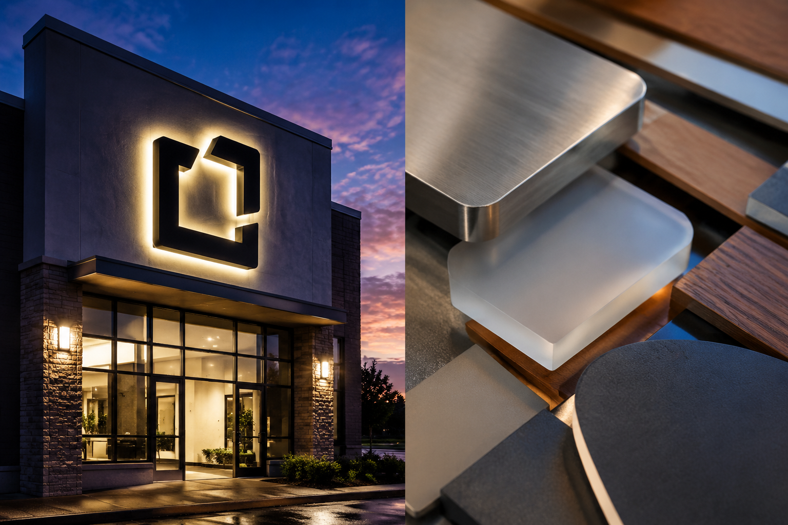
Materials, lighting, and placement
Materials
The material you pick affects how the sign looks, how long it lasts, and how much upkeep it needs.
Acrylic comes in a lot of colors and finishes, is lightweight, and holds up to weather. It works for dimensional letters, lightbox faces, and interior signs.
Metal (aluminum, stainless steel, bronze) gives a more upscale look. Aluminum is light and resists rust; stainless is strong with a modern finish. Common for dimensional letters, plaques, and monument accents.
PVC and foam are cheaper and light, often used for interior dimensional letters or as a base for painted signs. They usually need proper finishing to survive outdoors.
Wood suits a rustic or traditional feel at cafes, breweries, and specialty shops. Outdoors it needs more upkeep, especially with New Jersey's temperature swings.
Lighting
Lighting extends how many hours your sign stays legible, after dusk and in overcast conditions.
Front-lit signs pass light through the letter faces for bright, direct legibility, common on channel letters. Halo-lit (backlit) signs throw light backward for a soft glow around each letter, a quieter effect. Edge-lit signs run light through the edge of a clear panel to light up engraved or printed graphics, usually indoors. External lighting, like gooseneck lamps, mounts above or below the sign and shines onto the face, a traditional approach for signs that are not internally lit.
Placement
Where a sign sits matters as much as what it says.
Sightlines and speed come first: the sign has to read for approaching cars and pedestrians, which depends on how fast they are moving. Watch the scale too, since a sign that is too small gets missed and one that is too large overwhelms the facade or bumps into zoning limits. Check for obstructions like trees, utility poles, and awnings that block the view. The sign should suit the architecture, and how it mounts depends on whether the surface is brick, stucco, or glass. Before you lock in a design, confirm property management requirements and local zoning rules for size, placement, lighting, and allowed sign types.
Preparing for an accurate quote
Ordering a sign is a visual decision, and it moves faster when you show up with the details. Vague requests get vague estimates and more back and forth. A few things worth having ready:
- Logo and brand assets. High-resolution vector files (AI, EPS, or PDF) make for accurate design and production.
- Business type and use case. Retail, restaurant, office, medical, and so on, which narrows the suitable sign types and materials.
- Location photos. Clear shots of the exact wall or storefront, both a wide view of the building and close-ups of the mounting area.
- Rough dimensions. Approximate width and height of the space, which helps with scale.
- Sign type leanings. Even a general preference for channel letters, a lightbox, or a blade sign helps.
- Lighting needs. Whether you want illumination, and if so, front-lit, halo-lit, or externally lit.
- Material preferences. Any leaning toward metal, acrylic, or a mix.
- Known constraints. Landlord rules or permit questions you already know about.
You can request a free quote with these in hand to keep the conversation focused.
Using a visual mockup
Even with the right details, a sign is hard to picture before it exists. A mockup helps close that gap. Signage.com's Design Studio lets you drop your logo and a chosen sign style onto a photo of your own building so you can see roughly how it looks. It is a way to compare options, trying different letter styles, colors, and lighting types, and to get a feel for scale and placement. It is not a stand-in for final engineering drawings, permit documents, or fabrication and installation planning.
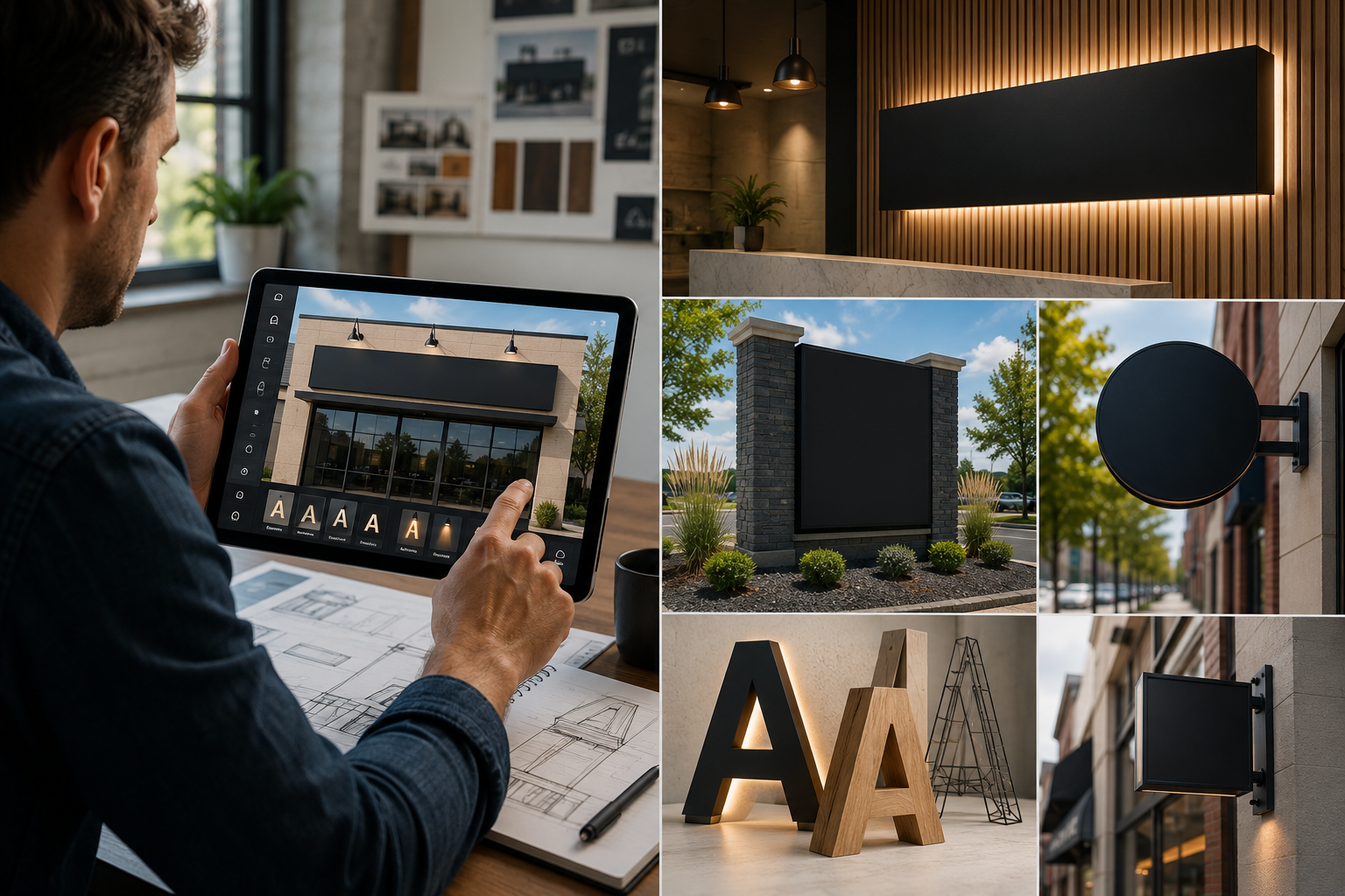
Pairing a mockup with quote-ready details gives you and your provider the same starting point, which usually means a clearer estimate and fewer surprises down the line.
What affects the cost
Sign pricing moves with the choices behind it. Knowing the main drivers helps you set a budget and compare quotes on the same terms.
- Sign type. Illuminated builds like channel letters generally run more than non-illuminated dimensional letters. Monument signs bring size and structural work that add up.
- Size. Bigger signs use more material and more involved fabrication.
- Materials. Stainless steel or bronze cost more than acrylic or PVC, and specialty finishes add to the total.
- Illumination. Lit signs carry the cost of LED components and wiring, plus the extra fabrication.
- Design complexity. Intricate logos, custom fonts, and detailed graphics take more design and production time.
- Installation. Mounting surface, height, and access all factor in.
- Permits and local rules. Many New Jersey municipalities require permits for exterior signs, which can mean application fees and sometimes size or design limits.
- Volume. Multi-location orders may do better ordering several signs together, depending on the project.
When you read a quote, look for these spelled out. A lower number sometimes hides a change in material or lighting quality that shows up later, so it is worth weighing price against how the sign will hold up.
Beyond the storefront: interior signage
Exterior signs pull people in. Inside, signage helps them get around and keeps the brand consistent once they are through the door.
- Lobby signs. Dimensional letters or acrylic panels on standoffs showing your logo in reception.
- Wayfinding. Directional signs for larger offices, medical complexes, and retail, pointing people to departments, restrooms, and suites.
- ADA signage. Tactile text and Braille where accessibility rules require it.
- Directional signs. Simple markers for specific areas or services.
- Point-of-purchase displays. Smaller retail signs for promotions or product information.
Keeping interior and exterior signage consistent strengthens the whole presence. In medical and professional settings especially, clear wayfinding and accessible signage help with both usability and the sense that the place is well run.
FAQ
What do I need before getting a custom sign quote?
Have your logo in vector format, photos of the location, rough dimensions for the sign area, a general idea of the sign type, and any material or lighting preferences. Noting landlord rules or permit questions you already know about helps too.
How long does a custom business sign take to make?
It depends on complexity, materials, how fast approvals come back, and any permit steps. Talk through your target timeline with your provider early so it can be built into the plan.
Do I need a permit for an exterior business sign in New Jersey?
Many exterior signs need a permit from the local municipality, and requirements vary by town. Check with your local planning or zoning department and your landlord before you finalize an order, since permitting can affect the timeline.
Can I see what my sign will look like before it is made?
Signage.com's Design Studio lets you preview a concept on a photo of your building to get a sense of scale, placement, and design options. It is a visualization aid used alongside the normal design and production process.
What is the difference between front-lit and halo-lit channel letters?
Front-lit letters light up through the face for bright, direct legibility. Halo-lit letters throw light behind each letter for a soft glow against the wall, a quieter look.
Which materials suit outdoor signs in New Jersey's climate?
Weather-resistant materials like aluminum, stainless steel, and quality acrylic are common choices for exterior signs that deal with changing temperatures, rain, and snow.
Where to start
Picking a sign comes down to a few practical calls: type, materials, lighting, and placement, weighed against your location and who you are trying to reach. Get your quote-ready details together, and use a mockup to sanity-check scale and placement before anything is built. When you are ready, you can explore custom business signs or request a free quote.
