


Corporate office signs work best as a set. The exterior sign helps people find and recognize your building. The lobby sign confirms they walked into the right place. When both use the same logo treatment, colors, materials, and lighting, the brand stays consistent from the street to the front desk. That consistency is usually what corporate buyers are after when they spec signage for one office or a dozen.
This guide is for whoever handles signage sourcing: office managers, facilities leads, brand managers, and procurement. It covers the main sign types for lobbies and exteriors, how to hold branding steady across locations, and the material and lighting choices that shape a quote.
Key takeaways
- Corporate signage covers two zones: the exterior (finding and recognizing your building) and the interior (confirming arrival and carrying your brand into the lobby).
- Lobby signs set the first in-person impression. Material, depth, and lighting carry most of that, more than size does.
- Exterior signs need to be readable at a distance, and often need a plan for nighttime visibility.
- Consistency across sign types and locations is what makes a multi-site program read as one brand.
- A written brand spec (logo files, colors, fonts, finishes) makes quotes more accurate and production more predictable.
- Visual mockups let you check scale, placement, and finish before you commit to fabrication.
Two jobs, one program
A corporate sign program answers two questions at two different moments.
Outside, someone is asking whether this is the right building and whether they can read it from where they are standing. That falls to exterior building signs, monument signs, and depending on the setback and site, pylon or blade signs.
Inside, the question shifts to whether they arrived somewhere that matches the company they expected. That is the lobby sign's job, backed up by wayfinding and door signage that speak the same visual language.
When those two moments connect, same logo, same color, a consistent material story, the experience reads as deliberate. When they don't, visitors notice the gap even if they can't name it. Most of the decisions below come down to closing that gap.
Interior signage: the lobby and beyond
The lobby sign is usually the first piece of your brand a visitor sees up close, so material and finish matter more here than raw size. You can browse options on the Signage.com indoor signs collection, but the main choices are a few sign types.
The reception or lobby sign is the centerpiece. Common approaches include dimensional letters in acrylic or metal, a routed logo on a backer panel, or halo-lit letters on a finished wall. Halo-lit metal reads modern and understated. Flat-cut acrylic reads clean and minimal. Match it to your wall surface, your lighting, and the personality of the brand.
In larger offices, wayfinding and directional signs keep visitors moving without asking for directions. Keeping the fonts, colors, and icons consistent across those pieces holds the interior together.
Conference room and door signs, whether dimensional letters or engraved plaques, can echo the lobby finish so the brand continues down the hallway instead of stopping at the front desk.
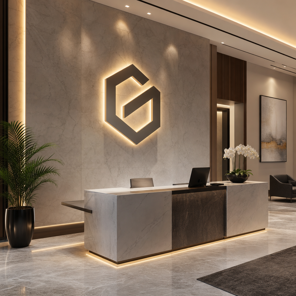
If you want a tactile, depth-forward look and your lobby already has good ambient light, non-illuminated dimensional letters tend to work well. If the wall sits in lower light, or you want the logo to hold attention as people walk in, an illuminated option like halo-lit letters makes more sense.
Exterior signage: visibility and recognition
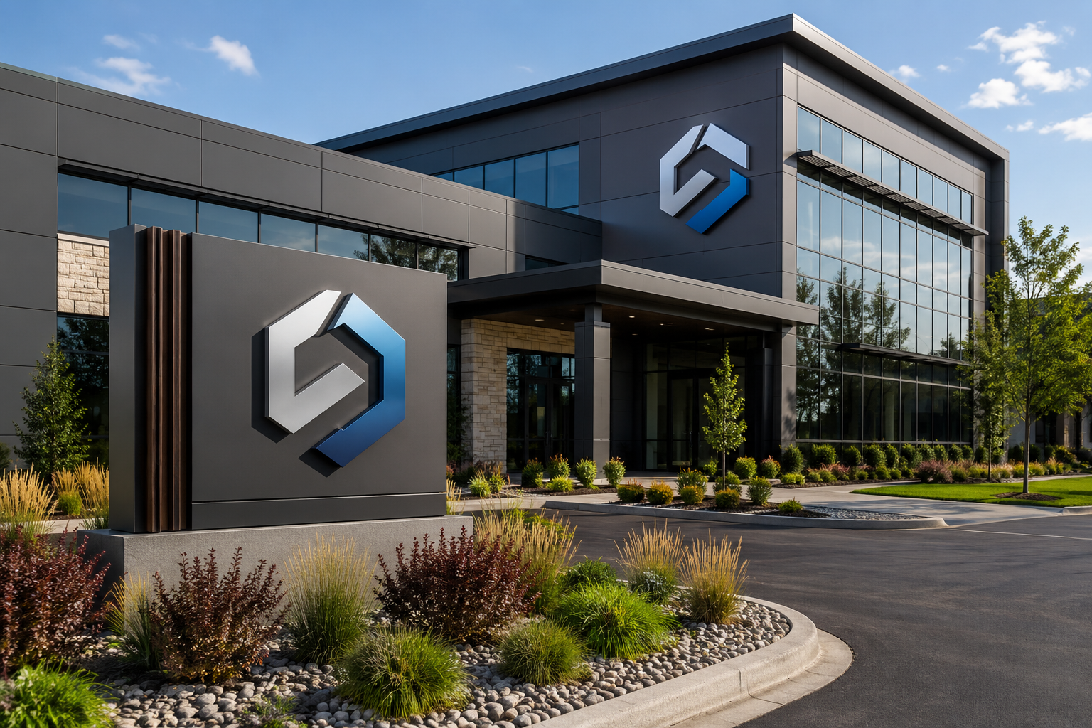
Exterior signs are the building's public face. They need to be legible from the distance people actually view them, durable against weather, and where nighttime visibility matters, lit so they stay readable after dark. The right type depends on your architecture, your setback from the road, and local sign rules.
| Sign type | Where it fits | What to weigh |
|---|---|---|
| Building / fascia signs (channel letters, lightbox, cabinet) | Mounted on the building facade; strong for logo-forward branding | Front-lit vs. halo-lit vs. non-illuminated; wall surface and mounting depth |
| Monument signs | Ground-level at a driveway or campus entrance | Footprint and foundation; can hold a logo plus a tenant directory |
| Pylon signs | Offices set back from the road or shared multi-tenant sites | Height and structure raise branding above obstructions |
| Blade signs | Urban storefront-style offices with foot traffic | Perpendicular mount improves visibility from both directions down the sidewalk |
One thing teams underestimate is lighting. A sign that reads fine at noon can vanish at night without it. If staff, clients, or deliveries show up after dark, weigh front-lit against halo-lit early. Designing lighting in from the start is easier than retrofitting it later.
Keep in mind that sign size, placement, illumination, and materials are often governed by local zoning and permitting that varies by municipality. Confirm the current requirements for your address with your local authority or a sign professional before finalizing a design. This article is general guidance, not a substitute for that review.
You can see the range of exterior options on the Signage.com corporate collection.
Consistency across locations
For a single office, consistency mostly means the lobby and exterior feel like the same brand. For a multi-location business, it means every site does too, so a client who visits headquarters and then a regional office sees one company rather than several. A few steps make that repeatable.
Start by writing a signage spec. Before anything gets designed, document the logo files, exact brand colors (Pantone and CMYK), approved fonts, and preferred finishes. Every sign gets checked against this.
Then standardize your types and finishes. Decide on a fixed set, for example front-lit channel letters in one finish for all exteriors and brushed-metal dimensional letters for all lobbies. That makes new locations faster to spec and easier to match.
Preview before you produce. Use visual mockups to see how a sign type, scale, and placement look on your actual building or lobby wall. The Signage.com Design Studio can help you visualize a mockup before production, which is useful for confirming look and layout. Treat it as a visual aid, not engineering, permit, fabrication, or code-compliance documentation, and keep those steps separate.
Finally, keep production coordinated. Whether it is one sign or a rollout across sites, sourcing matched types and finishes through a single program helps the pieces stay consistent from place to place.
Materials and lighting shape the quote
Material and lighting choices drive both durability and how the sign reads, and being specific about them makes the quotes you get back more accurate.
Exterior signs generally call for weather-resistant materials such as aluminum, steel, or exterior-grade acrylics that hold up to sun, moisture, and temperature swings. Interior signs allow more range, including acrylic, metal, and wood, since they are shielded from the elements.
| Option | Effect | Typical fit |
|---|---|---|
| Front-lit channel letters | Light emits from the letter faces; bright and direct | High-visibility exteriors |
| Halo-lit (backlit) letters | Light glows behind the letters onto the wall | A softer, understated exterior or lobby look |
| Lightbox / cabinet signs | Illuminated from within as a solid panel | Logos and layouts that read well as one lit shape |
| Non-illuminated letters | Rely on ambient or external light | Many interiors, and exteriors with adequate site lighting |
The best combination is the one that suits your architecture and brand. A tech firm might lean toward sleek halo-lit acrylic, while a traditional financial office might prefer heavier non-illuminated metal letters. There is no single right answer, only the one that fits your identity.
When you request a quote, name the specifics: material and finish (brushed aluminum versus polished brass), lighting type (front-lit LED versus halo-lit), indoor or outdoor use, and viewing distance. Photos of the intended spot help a sign company recommend options and return a closer estimate.
Mistakes worth avoiding
- Treating lighting as an afterthought. Decide early whether the sign has to read at night, and design for it.
- Legibility problems. Thin or ornate fonts, low contrast between text and background, and letters undersized for the viewing distance all hurt readability. Check it at the distance people will actually stand.
- Inconsistent branding. Signs that drift between the lobby, the exterior, or across locations dilute recognition. Hold each one against your spec.
- Buying on price alone. Under-specced materials or finishes can fade or degrade sooner and get replaced earlier. Weigh durability and finish against price, not price by itself.
- Skipping the preview. Guessing how a sign looks at scale on your wall invites surprises. Review a mockup to confirm layout, size, and finish first.
- Overlooking local rules. Sign regulations differ by municipality, so confirm current requirements for your site before you commit.
Where to start
If you take one thing from this, it is that the exterior and the lobby should tell the same story: the same logo, colors, materials, and lighting logic from the street to the reception desk, and from one location to the next. Write the signage spec, standardize your types and finishes, preview designs before you produce them, and confirm local requirements for your address. Handled that way, signage becomes a repeatable part of how your brand shows up in person.
When you are ready to spec a program, the corporate signage collection and indoor signs show the sign types described here.
FAQ
What matters most for a corporate lobby sign? Material, depth, and lighting relative to your wall and ambient light. Those carry the impression more than size. Pick a finish that matches your brand and a lighting approach, or none, that suits the space.
How do we keep branding consistent across multiple offices? Write a signage spec (logo files, colors, fonts, finishes), standardize a fixed set of sign types and materials for exteriors and lobbies, and coordinate production so each new location matches the established look.
Which exterior sign types suit corporate offices? Building and fascia signs (channel letters, lightbox, cabinet), monument signs, pylon signs, and blade signs are all common. The right one depends on your architecture, setback from the road, viewing distance, and local regulations.
Why use a visual mockup? It lets you check scale, placement, and finish on your specific building or lobby wall before fabrication, which cuts down on surprises. Tools like the Signage.com Design Studio help with that visualization. They are a design aid, not engineering, permit, or compliance documentation.
Can one program mix illuminated and non-illuminated signs? Yes. Plenty of corporate programs pair illuminated exterior signs for nighttime visibility with non-illuminated dimensional letters or plaques indoors, holding consistency through shared colors, fonts, and finishes.
How do materials affect durability? Exterior signs generally use weather-resistant materials like aluminum, steel, or exterior-grade acrylic to resist fading and corrosion. Interior signs face gentler conditions, so they allow a wider range of finishes.
