


Going from one storefront to several changes what your signs have to do. A first sign mostly needs to help one location get noticed. A second, third, or tenth sign has to do that and still read as the same brand across different buildings, streets, and local sign rules.
This guide covers how signage needs shift as you add locations, which sign types tend to suit which sites, how to keep a brand consistent, and what to have ready before you ask for a quote.
Key takeaways
- A single location is mostly about getting seen. Multiple sites add the job of staying consistent while getting seen.
- Uniform signs help customers connect each location back to the same brand.
- Brand elements stay the same, but the sign type (channel letters, monument, blade, and so on) often changes with the building and local code.
- A short internal "signage playbook" for materials, design, and lighting makes each new rollout more predictable.
- A visual preview, like one from the Signage.com Design Studio, helps you judge fit and scale before you commit to fabrication.
- Gathering photos, measurements, and brand files up front leads to clearer quotes.
- Faded, broken, or mismatched signs can make a growing brand look less settled than it is.
How signage needs change as a business grows
For a first location, the decisions are usually local: one landlord, one building, one set of ordinances. The goal is plain visibility, like front-lit channel letters for a retail space, or dimensional letters for an office lobby.
Add locations and each of those one-off calls has to be looked at more widely.
Brand consistency starts to matter more. Every sign becomes a touchpoint, and when signs drift in font, color, or style from site to site, recognition gets watered down.
Repeatability matters too. Ordering, approving, and installing signage should get more predictable as you grow, not less, and standardizing specs helps with that.
Buildings differ, so you also need some adaptability. A strip-mall space might call for a lightbox sign, while a standalone building suits a monument or pylon sign. Your identity has to translate across sign types while staying recognizable.
Coordination gets easier through one signage partner than a different local vendor per location, which helps keep quality and branding aligned.
Early choices can be expensive to unwind. A low-cost, low-durability look might feel efficient on one sign, but repeating it across many sites can work against the brand you are trying to build. A sign often gets judged before the business does, at every location.
Common signage types for multi-location businesses
Most growing businesses end up mixing sign types, matched to each property and its visibility needs while keeping brand elements consistent. The table sums up common options, with notes after.
| Sign type | Often fits | Illumination | Planning notes |
|---|---|---|---|
| Channel letters | Storefronts, building facades, high-visibility branding | Front-lit, halo-lit, or combination | Mounting method (raceway vs. flush), local electrical requirements |
| Lightbox / cabinet | Strip malls, plazas, nighttime visibility | Internal LED | Size and proportion to the building, face design |
| Monument | Business-park and complex entrances, campuses | Optional external or internal | Landscaping, local height rules, material choice |
| Pylon | Sites set back from the road, high-speed corridors | Optional internal | Larger upfront cost, permitting, possible shared tenant panels |
| Blade / projecting | Downtown retail, cafes, salons, foot traffic | Optional | Size limits, mounting stability, historic-district rules |
| Dimensional letters | Corporate, medical, professional, lobbies | External lighting only | Nighttime visibility depends on ambient light; outdoor durability |
A few notes on the choices you will run into most.
Channel letter signs use individual three-dimensional letters, so they carry custom fonts and logos well and read as a consistent storefront look across locations. On Signage.com you'll find front-lit, halo-lit/backlit, and raceway-mounted options in the outdoor signs collection.
Lightbox (cabinet) signs hold internal LED lighting behind a translucent face, which gives steady day-and-night visibility that suits a lot of retail and restaurant settings.
Monument signs sit at ground level near an entrance and read as permanent, guiding customers before they reach the door. Pylon signs raise visibility from a distance, which helps sites set back from the street or along faster roads.
Blade signs project from the facade for people walking up along a sidewalk, which is handy in walkable districts. Dimensional letters give a clean, modern look for lobbies and professional-services branding.
Getting the mix right keeps your presence recognizable from site to site.
Keeping a brand consistent across sites
Consistency is not about making every sign identical. It is about making every sign clearly belong to the same brand. The practical way to get there is to write the standards down and route decisions through them.
Start with brand guidelines for signage. Document logo specs (dimensions, clear space, approved variations), color references (PMS/CMYK) so colors hold across materials, approved typography and sizing, preferred materials and finishes, and lighting standards, like which signs are front-lit versus halo-lit.
Then keep approval in one place. Rather than letting each site decide on its own, run designs through a single review so each project matches the guidelines. Working with a partner who can hold the same fabrication methods and materials across sites also helps the look stay aligned even when locations are spread out.
A short signage playbook speeds things up. Something like "channel letters for street-facing retail, dimensional letters for interior lobbies, monument signs for park entrances" gives each new site a starting point instead of a blank page.
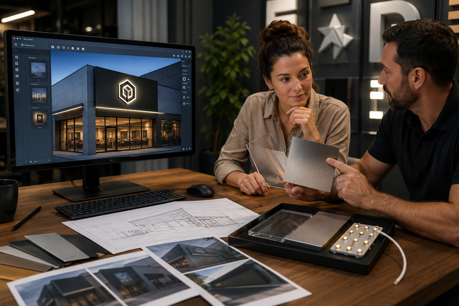
Preview before production. A visual mockup for each location lets you compare letter styles, colors, lighting, and scale against the actual storefront before anything is built.
Check on what is already up, too. Periodic looks at existing signage keep the physical brand from slipping, since one faded or broken sign can color the impression of the whole company.
Planning for growth
A repeatable approach means building frameworks now that you can reuse later, so opening a new location doesn't restart the whole signage process.
Lock the core elements first: logo presentation, primary colors, key fonts, the pieces that show up on every sign no matter the type. Specify preferred materials and construction methods so quality and durability stay steady across outdoor and indoor signs.
Design for flexibility where it counts. A logo that works as a small blade sign and also as a larger pylon panel adapts to different buildings without changing the message.
A relationship with a provider who has done multi-location and coordinated sign programs helps when you are working across different jurisdictions and building types. Keep your assets ready to share as well: vector logo files, photos of each new facade, rough sign-area measurements, and any landlord or local guidelines you already have. Good quotes start before the request goes out.
Budget with the cost drivers in mind, mainly sign type, materials, and lighting, so future estimates stay realistic. And map out permits and installation early. Requirements vary by location and aren't guaranteed, but a partner who can walk you through the typical steps is useful. Treat permitting and code compliance as work to confirm locally, not as something a mockup settles.
Where visual previews and mockups fit
Custom signage is a visual purchase, and a mockup turns a vague idea into something everyone can look at on the actual building.
A preview makes the decision concrete. You can see how a sign works with the architecture, lighting, and surroundings instead of imagining it. It also checks fit and scale, since a design that looks right on paper can read too small from the road or too heavy up close. A mockup shows whether channel letters are proportionate to the storefront.
Previews help confirm brand alignment across each different site, checking color, font, logo placement, and overall look against your guidelines. They also support approvals, since landlords, property managers, and internal teams often need to sign off and a clear visual gives everyone the same reference. Catching a scale or alignment issue before fabrication beats catching it after.
Signage.com's Design Studio is an AI-assisted mockup tool built for this stage. It helps you picture a concept, including letter style, color, lighting, and scale, often on a photo of your own storefront, so you can start the quote and production conversation with more clarity. Treat those previews as a design and alignment aid, not as final engineering drawings, permit documentation, fabrication specs, or code-compliance sign-off. Those get confirmed separately.
What to prepare for a multi-location sign quote
The more specific your request, the clearer the quote. Here's what's worth gathering before you reach out.
- Business and brand assets: your industry, high-resolution vector logo files (AI, EPS, or PDF), and brand guidelines if you have them.
- Location details, per site: full address, clear well-lit facade photos from a few angles, the intended mounting area, rough measurements of the available space, and photos of nearby storefronts for context.
- Preferred sign type(s): channel letters, lightbox, monument, blade, dimensional letters, or just a description of the goal if you're unsure, like "visible from a busier road" or "clean lobby sign."
- Lighting: whether you want illuminated signs, the style (front-lit, halo-lit, internal LED), whether electrical access exists at the location, and any color or effect you have in mind.
- Materials: any specific materials or finishes you're after, and the general look you want.
- Mounting surface and method: brick, stucco, metal panel, glass, and any preference for flush, raceway, or post mounting.
- Timeline and budget, if known: target windows and a rough range, which helps guide material and design suggestions.
- Landlord and local information: known landlord restrictions or property-management guidelines, plus any local zoning or permit details you already have.
- Contact: the primary contact and the best way to reach them.
Having these ready lets a signage partner come back with more accurate detail, and lets you use the Design Studio to preview options before you commit.
Mistakes to avoid while expanding
At scale, one oversight can repeat across sites. A few to watch for:
- Inconsistent branding. Different fonts, colors, or sign styles across locations blur recognition.
- Skipping local rules. Size, placement, lighting, and material rules differ by city, county, and property, so confirming them for each new site avoids delays and rework.
- Underestimating visibility. A sign that works on a quiet street can get lost on a busy corridor. Account for traffic speed, distance, and clutter per site.
- Wrong sign for the location. One type rarely fits all. A monument sign suits a park entrance but not a second-story office.
- Cutting corners on materials. Low-durability choices can fade or crack and read as neglect.
- Weak or missing lighting. A sign that disappears after dark loses part of its value.
- Skipping mockups. Verbal descriptions or flat 2D art make scale and color hard to predict, and a preview helps.
- Fragmenting the process. Letting each site source signs on its own tends to produce a patchwork look.
- Ignoring maintenance. Signs are assets, and routine cleaning and repair keep the brand looking cared for.
Wrapping up
Scaling from one location to many turns signage from a visibility task into a brand-and-operations one. How you handle design, materials, lighting, and process shows up at every site. Staying consistent while adapting to each building, and using mockups to cut guesswork before fabrication, makes expansion smoother and your presence more cohesive.
When you're ready, you can preview concepts with the Design Studio, browse options like channel letters and monument signs in the outdoor signs collection, or start at Signage.com to plan your next location.
FAQ
How does signage for a single location differ from multiple locations? A single location is mostly about immediate visibility. Multiple locations add brand consistency, repeatability, and adapting across varied buildings and local rules, so the whole footprint reads as one brand.
What sign types do growing businesses commonly use? Channel letters, lightbox/cabinet signs, monument signs, pylon signs, blade signs, and dimensional letters, chosen to fit each building and visibility need while keeping brand elements consistent.
Why does brand consistency matter across sites? It supports recognition and a professional impression. When signs vary a lot from site to site, customers have a harder time connecting them to the same business.
What is a signage mockup, and why is it useful for expansion? It's a visual preview, often AI-assisted like the Signage.com Design Studio, showing how a proposed sign could look on your specific building. It helps you judge scale, design, and placement before fabrication. It's a design aid, not final engineering, permit, or compliance documentation.
What should I prepare for a multi-location sign quote? Vector logo files, facade photos and measurements for each site, preferred sign types, lighting needs, material preferences, any landlord or local guidelines, and your timeline and budget if known.
What mistakes should I avoid when expanding my signage? Inconsistent branding, skipping local sign rules, underestimating visibility, choosing the wrong sign type for a site, cutting corners on materials, weak lighting, and skipping mockups.
