


Picking between a building sign and a storefront sign is partly a design call, but it's mostly a call about where people first notice you. Both fall under outdoor business signs, and they do different jobs. Building signs tend to be larger and mounted higher so they read from a distance. Storefront signs sit closer to eye level, where they help someone on the sidewalk recognize your brand and find the door.
Here's how the two compare, where each tends to fit, and the details worth sorting out before you ask for a quote.
Key takeaways
- Building signs are built for distance and presence. Think channel letters or a lightbox (cabinet) sign.
- Storefront signs work up close to reinforce your brand and get people through the door, usually as dimensional letters, blade signs, or window graphics.
- What's right for you comes down to your location, how far away people see you, your building and lease limits, and local rules.
- Plenty of businesses run both so the experience feels of a piece from the street to the entrance.
- Lighting, materials, and where the sign sits all change how it reads by day and at night.
- A mockup helps you compare options before you get into specifics with a sign maker.
What sets a building sign apart from a storefront sign
The difference is job, placement, and scale. A building sign is meant to be spotted from a distance and to hold down your presence across a commercial area. A storefront sign handles the last few steps, the moment someone decides whether to walk in.
Building signs: seen from a distance
Building signs are generally larger and mounted higher on a facade or near the roofline. The point is to make you identifiable from a road, a parking lot, or across a bigger site, often before anyone is close enough to read the small stuff.
Formats you'll see a lot:
Channel letter signs use individual dimensional letters, often lit from the front (front-lit) or from behind against the wall (halo-lit). You can customize font, color, and size. If you're leaning this way, the channel letter signs collection shows the format in context.
Lightbox or LED cabinet signs are illuminated cabinets with a translucent printed face, so your branding shows up as one bright, even panel.
Dimensional letters are non-illuminated (or externally lit) letters cut from metal or acrylic, giving a raised, three-dimensional look against the wall.
Choosing a building sign usually means weighing the building's architecture, the mounting surface, how far away customers need to read your name, and whatever zoning or landlord rules apply.
Storefront signs: recognized at the door
Storefront signs are usually smaller, more detailed, and placed on or beside the entrance. They talk to people who are already close, confirm they're in the right spot, and help curb appeal at short range.
Common formats:
Blade signs project out perpendicular to the facade, so pedestrians see them coming from either direction. Handy on walkable, busier streets.
Dimensional letters at a smaller scale give a clean, professional entrance.
Window graphics go on the glass for a logo, hours, services, or a seasonal note, using window space that would otherwise sit empty.
Awnings add shelter and a branding surface for a name or logo.
Plaque signs are compact metal or acrylic signs that fit professional offices and service businesses.
For storefront signs, legibility and consistency with the rest of your branding do the heavy lifting. It should be easy to read for someone standing right in front of the space.
Why the difference matters for visibility and trust
Building, storefront, or both, the choice shapes how people find you and what they expect on arrival. A building sign helps them locate you. A well-kept storefront sign tells them they've reached a business that pays attention. Together they can form a continuous path from the street to the door.
Reading you from far off vs. up close
A clear building sign helps a store, restaurant, office, or clinic get picked out from a main road or across a shopping center or multi-tenant property. If you share a building with other tenants, the building sign is often the main way people find you at all.
Once someone arrives, the storefront sign carries the impression. Faded or beat-up storefront signage can read as neglect. Clean, legible signage tends to feel more professional and welcoming.
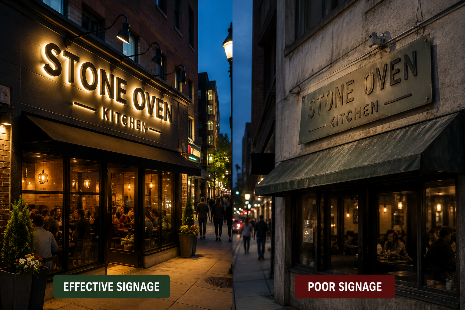
Lighting and materials
Lighting matters for both, especially if you're open in the evening or your location doesn't get much ambient light. Illuminated building signs (front-lit or halo-lit channel letters, or lightbox signs) keep you visible after dark. Storefront lighting can be anything from subtle backlighting on dimensional letters to external fixtures that keep the entrance readable at night.
Materials shape durability and appearance. Building signs often use weather-resistant materials like aluminum and acrylic, since they're exposed to the elements. Storefront signs might use acrylic, metal, PVC, or wood, which gives you more range in texture and finish to match your look.
Pick lighting and materials with your hours, exposure, and brand in mind, and the finished sign holds up better over time. Final material, structural, and electrical decisions get confirmed during fabrication planning, not at the concept stage.
Building signs vs storefront signs, side by side
| Feature | Building signs | Storefront signs |
|---|---|---|
| Main goal | Distance visibility, brand presence | Close-range attention, guiding people in |
| Typical placement | High on the facade, roofline, street-facing walls | At or near the entrance, windows, perpendicular to the facade |
| Visibility range | From roads and across large sites | From the sidewalk and direct approach |
| Common types | Channel letters, lightbox signs, monument signs | Dimensional letters, blade signs, window graphics, awnings |
| Where it's strong | Establishes presence and helps people navigate | Supports curb appeal and reinforces brand at the door |
| Lighting | Often illuminated (front-lit, halo-lit) | Illuminated, externally lit, or non-lit |
| Material focus | Durability and weather resistance | Finish, detail, and brand consistency |
Signage mistakes worth avoiding
Signage is easy to underrate. Treat it as decoration instead of a visible piece of your brand and it tends to show. A few recurring issues to plan around:
Skipping local rules and lease terms. Sign permits and landlord requirements vary by location. Check what applies to your site before you lock in a design or size. Requirements are specific to each jurisdiction and property, so confirm with your local authority and property manager.
Hard-to-read design. Cramped fonts, low-contrast colors, and busy layouts all cut legibility. Keep it clean, on-brand, and readable at a glance.
Lighting that doesn't match your hours. A sign that looks great at noon can vanish at night. Think about when you're open and how much light is around you.
Sizing and placement that don't fit. A sign too small for its viewing distance, or set in an awkward spot, gets missed. Test the scale before you finalize.
Chasing the lowest price on its own. Cutting quality to save upfront can mean earlier fading or replacement. Weigh cost against durability and how the sign represents you.
Getting quote-ready
The more you can share, the more useful the quote conversation is. A starting checklist:
- Business type and location, for example retail, restaurant, office, or clinic, plus the address.
- Logo and brand assets: high-resolution vector files (AI, EPS, PDF) and any brand colors or fonts.
- The sign type you're considering: channel letters, lightbox, blade sign, dimensional letters, or not sure yet.
- Indoor or outdoor.
- Approximate size. Even rough height and width helps. Measure the available mounting area if you can.
- Mounting surface and context: photos of the building or storefront, plus the surface material (brick, stucco, metal, glass).
- Lighting preference: front-lit, halo-lit, external, or non-illuminated.
- Any materials you have in mind.
- Timing and installation questions: your ideal timeframe and whether you'll want installation guidance. Availability and lead times get confirmed per project.
Where a mockup helps
Signage is a visual decision, and it's hard to judge from a spec sheet. Signage.com's Design Studio is a mockup tool that lets you preview sign concepts, often on a photo of your own building or storefront, so you can compare letter style, color, illumination type, and scale side by side. It's a way to cut down guesswork and start the quote conversation with a clearer picture. Treat it as a visualization aid, not final engineering, fabrication, permit, or code-compliance documentation, which is handled separately during production planning.
A quick way to narrow it down
| If your situation is... | Consider starting with... |
|---|---|
| People mostly see you from a road or large lot | A building sign (channel letters or a lightbox) sized for distance |
| Most of your traffic is walk-by at the entrance | A storefront sign (dimensional letters, a blade sign, or window graphics) |
| You get a mix of both | A coordinated pair: a readable building sign plus a detailed storefront sign |
| Night visibility matters | An illuminated option, with lighting matched to your hours |
Where this leaves you
Building signs and storefront signs solve related but separate problems. One helps people find you from a distance and holds your presence. The other works up close to reinforce your brand and welcome people in. For a lot of businesses, running both is what makes the experience feel consistent from the street to the door.
Start with your location, how far away people see you, your building and lease limits, and the impression you want to make. From there, a mockup lets you compare formats before you request a quote. You can browse options in the outdoor signs and channel letter signs collections to see how they look in practice.
FAQ
Can I use both building signs and storefront signs? Yes. Many businesses pair the two so they're identifiable from a distance and inviting at the door.
Do building signs usually involve more permitting than storefront signs? They can. Larger or illuminated signs may face more requirements because of size, electrical components, and structural factors, but rules vary by jurisdiction and property, so confirm locally.
What sign type suits a multi-story building? Channel letters or a lightbox mounted higher on the facade are common picks for taller buildings, since they still read from street level.
How can I see what a sign might look like on my building? Signage.com's Design Studio lets you preview sign types, materials, and lighting on a photo of your building as a visualization aid.
Are there more energy-conscious options? Many current signs use LED lighting and materials like aluminum or acrylic, which can support more efficient, recyclable choices.
What should I gather before requesting a quote? Your logo files, photos of the location, approximate dimensions, the sign type you're considering, and any material or lighting preferences.
What is a raceway-mounted channel letter sign? It's a channel letter set attached to a rectangular metal enclosure (the raceway) that holds the electrical components, which can simplify mounting on some building signs.
